One product, multiple users – this results in very specific challenges. Learn how to overcome the most important ones in this article.
- Do you know one or more of the following problems?
- Do you have a product that is to be used by several different user groups?
- Are you unsure how to design the user interface so that all user groups experience good usability and user experience?
- You want to meet the requirements of all users without making the user interface overloaded and unnecessarily complicated?
- Do you want clear examples of how other products have solved these challenges?
- Do you need help deciding which of the solutions presented here might be right for you?
Then this is the right article for you! Here we want to explain clearly and concisely how you can tackle the above problems.
What challenges arise from the special situation: one product, multiple users?
We have identified the following challenges:
- Different characteristics: different users also mean different places of use with different requirements, different previous experience, skills and abilities. Different tasks and work equipment needed for them also count here. Different physical and social environments must also be considered.
- Different prior experience: You’ll notice it in the examples: user interfaces are often used by users with very different prior experience and skill levels. User interface requirements and the need for tutorials or explanations often differ between user groups.
- Completely different tasks, processes and workflows: If, for example, an expert operates a device, he may want to solve completely different tasks with it than a layperson. These different objectives often result in different workflows and processes, which must then be correctly mapped by the user interface.
Who are your own user (groups)?
In order to design a user interface for multiple user groups, you need to know these groups in your most important characteristics. So let’s take a look at what EN ISO 9241-11:2018 defines as a user group:
“Subgroup of intended users that is distinguished from other intended users on the basis of characteristics of the users, tasks or environments that could affect fitness for use.” (source: DIN EN ISO 9241-11:2018)
In order to design suitable solutions for your own user groups, you need to get to know these groups very well in the following areas:
- Features
- Tasks
- Environments
So, you need to know the use contexts of each user group.
Basic understanding of the context of use
Before you can design a user interface, you should perform a context of use analysis. In this, you clarify:
- What exactly is the task the user is performing?
- What information and materials does he need to perform it successfully?
- What are the content flows? (What is the user doing? How long does he do it? How often does he need to perform something?)
- What is the timing of the task?
- What are the spatial conditions and how do they influence the execution of the task?
- What are the motivations and needs of the user?
There are a few methods available for this, the combination of which often yields the best results. Fundamental for context of use analysis are (field) observations, interviews, contextual inquiries and task analyses.
If you know the user groups and the respective usage contexts, you can now design user interfaces for the respective needs and tasks. You have two basic options to build on.
Option 1: Same task for the user groups? The solution: Configurable user interfaces
Do your user groups have basically the same tasks? Here is the solution: a configurable user interface. The basis of the user interface remains the same, while the individual user (groups) are offered customization options. Switchable menus, presets and templates that can be saved are all ways to make a user interface configurable for the different user groups.
In this option, you solve the different requirements of the user groups by designing the core user interface so that users can independently tailor it to their own requirements.
Option 2: Different tasks of the user groups? The solution: Different user interfaces
If the core tasks of your user groups differ greatly, then you should design several user interfaces that are tailored to the respective tasks and needs. This means, for example, that you can access two different views via one access point.
At the same time, your product does not always have to be accessed via one access point. And this access does not always have to be a digital user interface. For example, clients of a bank have the option of managing their account via online banking, going to an ATM, or getting advice and help directly at the counter.
Addendum: With the Data Driven UX Design Process to MVP and the Focus for the Essentials
Having to design many user interfaces can be very time consuming. To avoid losing focus, here’s what you can do: it helps if you define and design the MVP for each user group.
An MVP is the Minimal Viable Product, that is, the product that consists solely of the core features that your particular user group needs to perform their task satisfactorily and efficiently. Features prioritized as medium-important can then be added later and added to the product.
This also applies to the configurable views of a user interface addressed in Option 1. Here, the key questions are then “What do I need to make configurable?” and “What absolutely needs to be there so that the respective user group can solve their tasks properly?”.
This is where the Data Driven UX Design process comes into play. It helps you identify user needs correctly and then implement them specifically in user interface design. In the process, your solution approaches are tested with wireframes in rapid iterations.
By getting feedback from real users, you can make sure that you identify the core features you need for your MVP and that your product is on the right track.
Important: You should always test the user interface at the concept level, and only then move on to the visual design.
Only when a user interface allows the user to achieve his goal effectively and efficiently, you have created the basis for a good product, i.e. defined your MVP.
If you want to learn about the process in detail, check out our article “From UX Testing to User Interface Design“.
Want some examples?
If you now see your original questions answered, you can skip to the conclusion. However, if you’d like to know how other products have solved the “one product, multiple users” issue, below are some illustrative examples of different approaches. We end with a product where we ourselves were involved in the user interface design and had to consider a large number of possible user groups for a product.
Example 1: Multiple user interfaces of a single product
What might this look like in practice? Think of sales platforms like Ebay or Amazon. Here you have sellers and buyers each using the same platform. However, the tasks and needs of the two user groups differ greatly.
While a buyer wants to find a suitable product as quickly as possible and find out about it so that he or she can buy it afterwards if necessary, sellers have completely different requirements for the same platform. Sellers want to post products, present them, need the relevant data of the buyers to be able to ship the product and, if necessary, want to have statistics on their own sales. Completely different user interfaces are needed. So here we have an example that belongs to option 2.
In the Amazon example, additional user groups are added: With Amazon Business, you can make purchases for your own company, manage budgets, have your manager approve the purchase of products, and much more.
For example, this is what the view for buyers looks like when using Amazon commonly:
The Amazon user interface for buyers. A product has been added to the cart. Now there are “Proceed to Checkout” and “Proceed to Cart” options.

If you look at the Amazon Business variant, for example, there is an additional function: you may have to have a supervisor approve the purchase of a product:
A text hint in the Amazon Business user interface that tells the buyer that the order must be submitted for approval by a supervisor.

Many other subtleties and differences in the respective user interfaces present themselves. Different user tasks require different user interfaces. Nevertheless, it should be possible for users of one interface to quickly learn how to use a similar one.
Example 2: Configuration options for a user interface
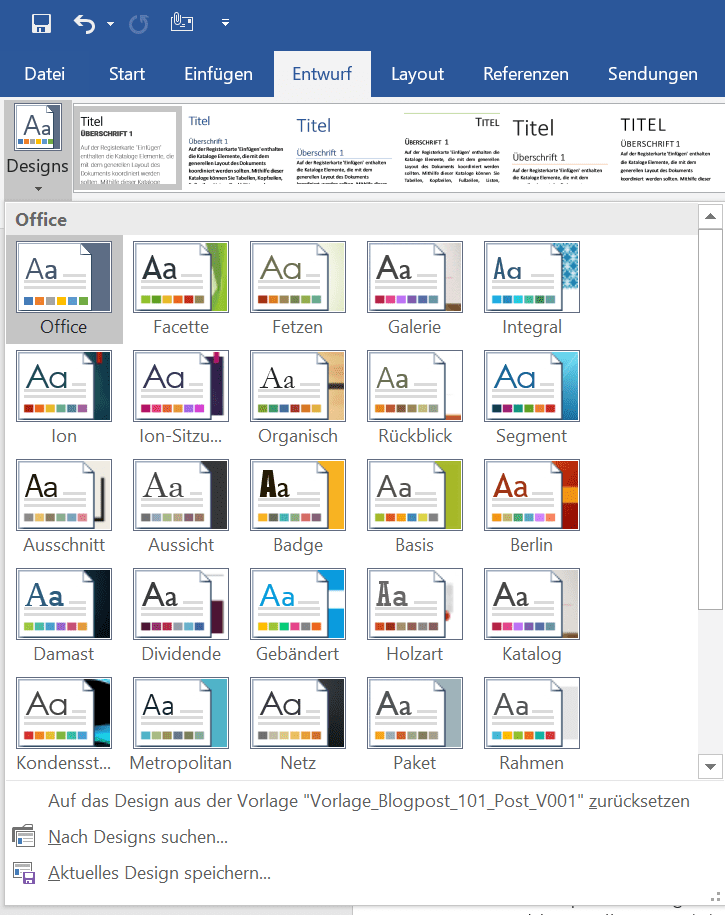
Applications such as Photoshop and Microsoft Word are prime examples of products that can be customized to meet user needs. They are therefore a good example of a product that can be attributed to option 1 mentioned above: “Configurable User Interfaces”.
A professional novelist often has very different requirements and needs when producing text than someone who wants to produce a scientific text. Basically, however, the basics of the task are the same: It should be possible to create, save and edit a text in a document.
Word solves this challenge with a customizable workspace. For example, a novelist may want to comfortably navigate through his or her own voluminous work, while a scientist may want more templates for proper citation of his or her cited sources. Each of the two can assemble what they need from umpteen granular levels in Word and then save that as a template.
Different levels of experience also benefit from these configuration options: Beginners, for example, can quickly pick a ready-made layout. Now the tasks of the user groups may not differ, but the experience level does.

Or, as an advanced user, they can create their own layout from many small parameters:

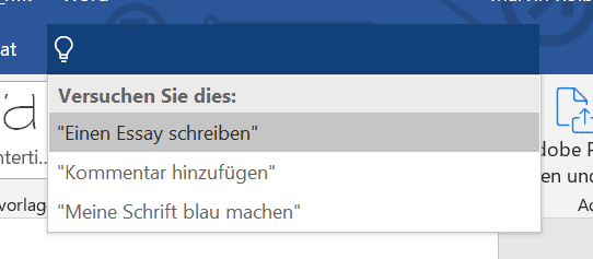
Word and Photoshop also offer tutorials for beginners. These make it easier to get started with the complex programs. Microsoft Word has even named some predefined problems for some users:

Example 3: Ergonomic customization options: One car, multiple drivers
The “one product, multiple users” problem can also involve the ergonomics of a product. We have two examples of this:
Every car can be adjusted to fit multiple drivers. Seats are height-adjustable, can be moved forward or backward, all mirrors can be adjusted to the needs of different car users. So this is an example belonging to option 1 above (“Configurable User Interfaces” – in this case configurable products).
E-gym devices in gyms masterfully solve the problem of different user requirements. Each user has his or her own wristband, which is held against a chip sensor on the respective device. This automatically adjusts to the user’s height and weight. Training weights or specific features in the execution of the exercise can also be recorded and personalized. The data on the user’s preferred use and ergonomics are thus stored on a wristband and are then only retrieved and immediately “implemented” by the device.

(source: E-Gym Webseite)
Example 4: Adaptive user experiences
Some products rely on tutorials and help. In order to pick up many different user groups as well as possible at the current level of knowledge, adaptive help and adjustments are used here.
What can this look like? In video games, for example, the difficulty level can automatically adapt to the player’s skills and thus ensure an optimal gaming experience with a suitable challenge level. In other words, the product is configurable and adapts to the user’s level of knowledge, skills and abilities. So this example also falls under “Option 1.”
In the soccer simulation FIFA, this is what happens. New players are thrown into an ongoing game. This starts at a very low difficulty level. The better the player does, the more difficult the game becomes. At the end of the game, a challenge level that fits the skill is then suggested.
Games like the parts of the Resident Evil series or Red Dead Redemption 2 (and countless others) recognize when a player fails a major challenge multiple times. The consequence of this: the game suggests an easier difficulty level.
How can the design process look in practice? A short excursion into the world of industrial scales:
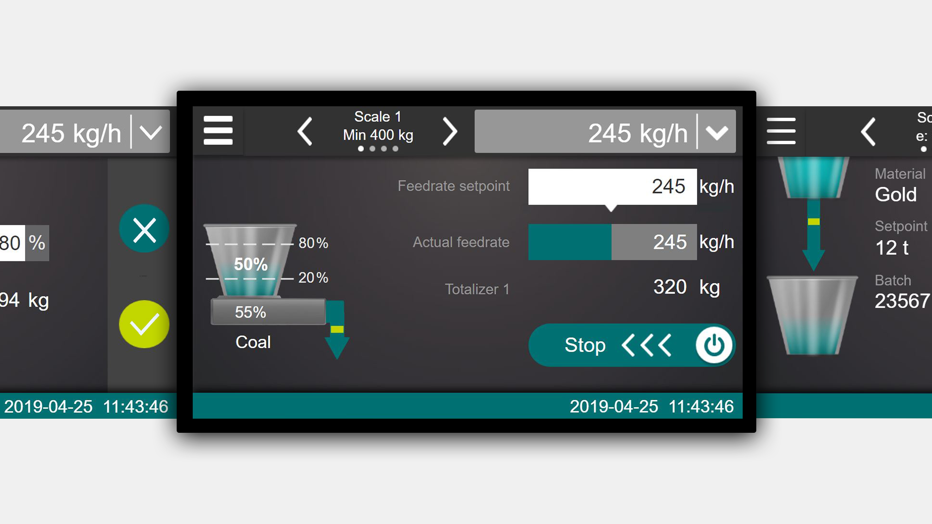
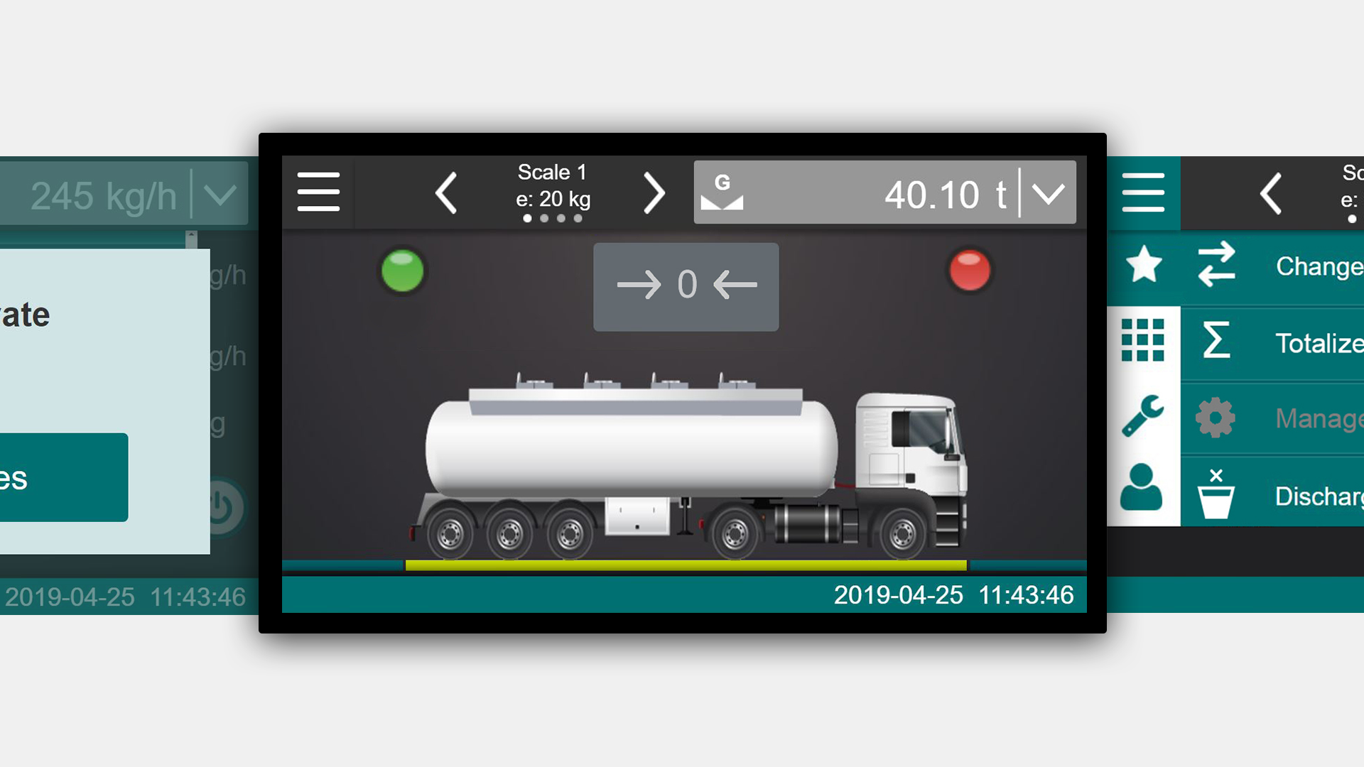
CONiQ is a weighing system designed by Schenck Process. This weighing system is used in an incredible variety of industrial workplaces. You can use it to weigh flour in an industrial dough production facility, but also containers on a crane. CONiQ is therefore a showcase example of the case: one product, multiple users.
The previous model provided up to 700 adjustable parameters – all accessible via a single-line display.
The challenge the product presented us with: A common denominator had to be found for:
- completely different weighing tasks
- by completely different educated and trained users
- in completely different processes and environments
So if we were to assign this example to one of the two options above, it would be a clear case for an example from option 2: So different user interfaces as a solution for different user groups.
Here, the user interface should be intuitive to use without user training.
This is how we solved the “one product, multiple users” challenge in this case:
- The interaction and visual design was developed in several iterations and thus tailored to the respective user groups
- The basic design allows for optimal execution of steps for all users, and that across application areas. Thus, there is a basic user interface that can be customized for the user groups
- Highly specialized applications for different user groups can be added easily
- The hardware has been designed to be as flexible as possible. For example, it is available as a small box without a display, but also as a tabletop device with an integrated display – in this way, different usage contexts could be optimally served.
You want to read the complete case study? You can find it here: “Case Study – CONiQ“


Conclusion
To master user interface design for a product that will be used by multiple user groups, always start by getting to know the context of use – your users, their needs and tasks, requirements, prior experience, skills and abilities, physical and social environments, and the work tools they will need. Then you design the user interfaces perfectly tailored to the users in short iterative sprints. In doing so, you have two basic options to build on.
If your user groups have basically the same tasks, then you can build a user interface that is configurable.
Do your user groups have different tasks? Then it makes sense to design different user interfaces that are tailored to the different user groups.
Do you have questions about the design of your user interface in your specific case? Feel free to get in touch via our contact form and arrange a free introductory meeting with us.
Have you already had the “one product, multiple users” case? We are very much looking forward to your feedback!


