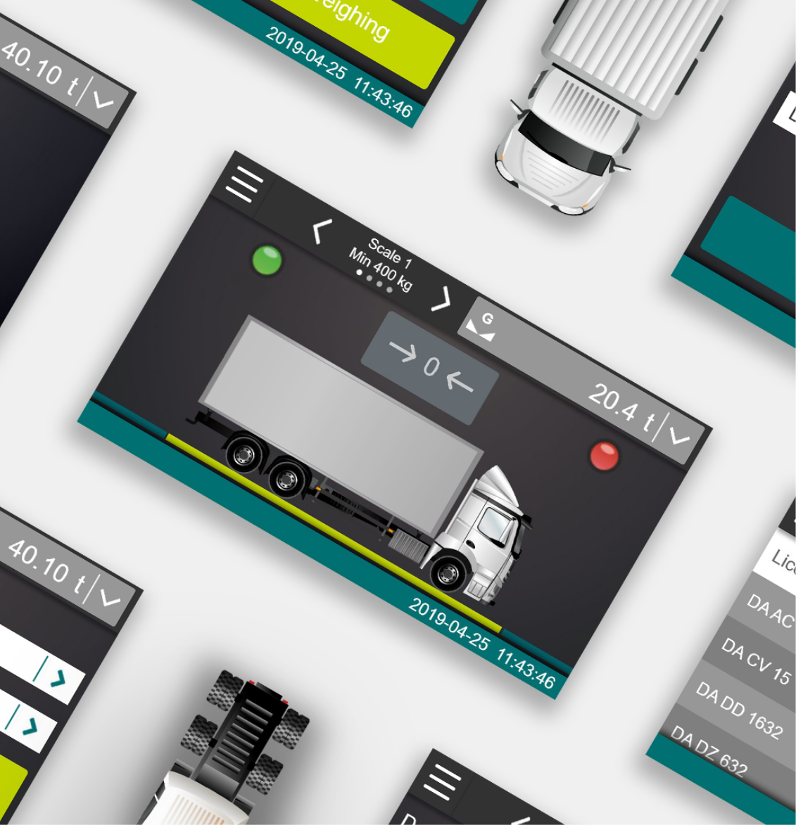
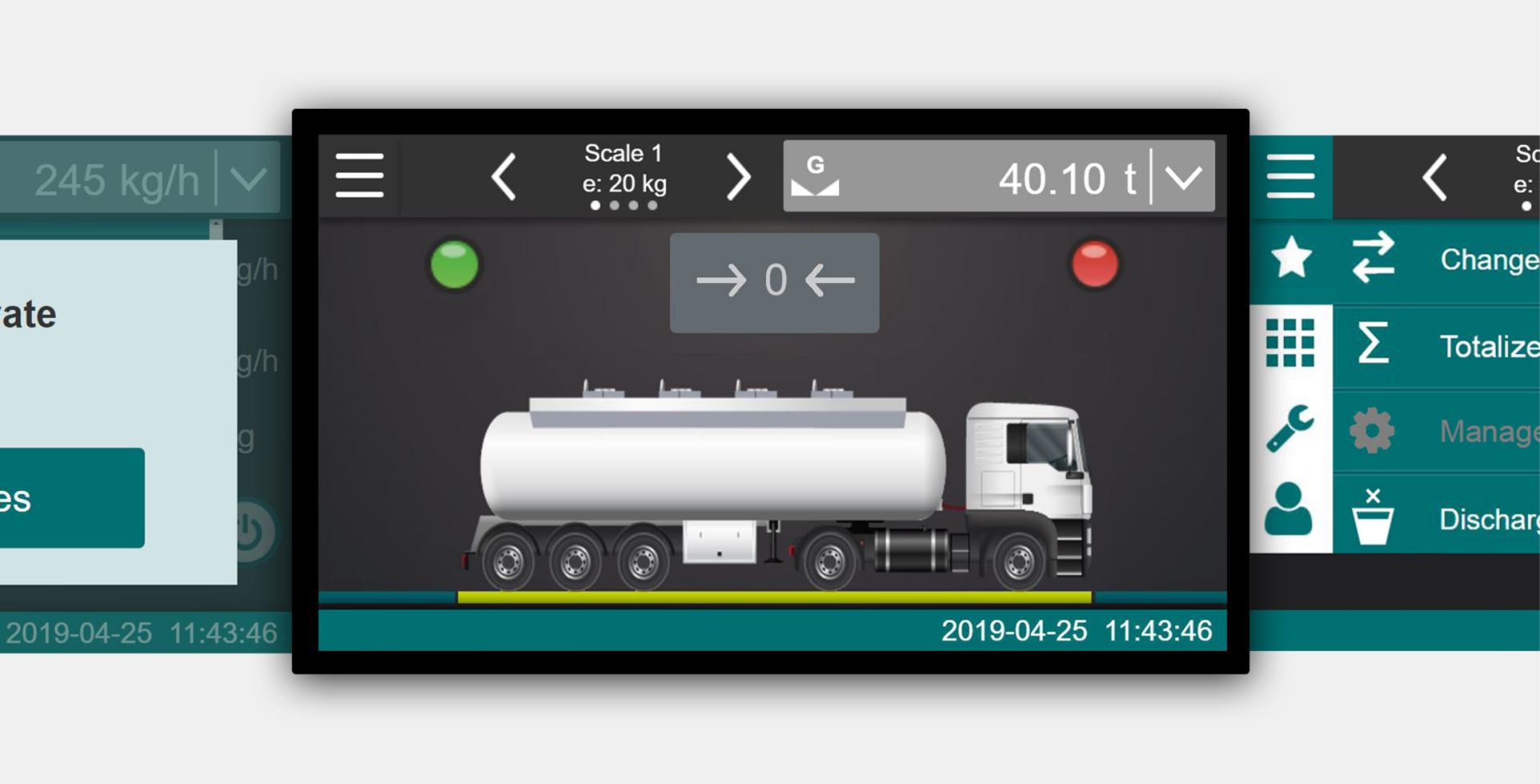
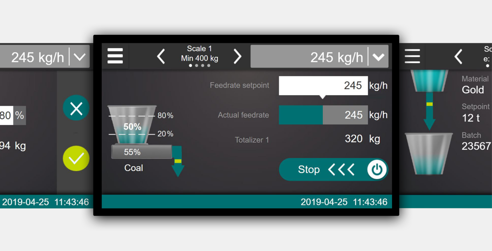
CONiQ is an innovative weighing system for a wide range of industrial applications. From weighing flour in an industrial dough production to weighing containers on a crane – CONiQ is suitable for very different environments and tasks.
To optimally support different users in their tasks, we have equipped CONiQ with an easy-to-use user interface. Find out how we were able to achieve this and what other results were achieved on this page.

Initial situation & project
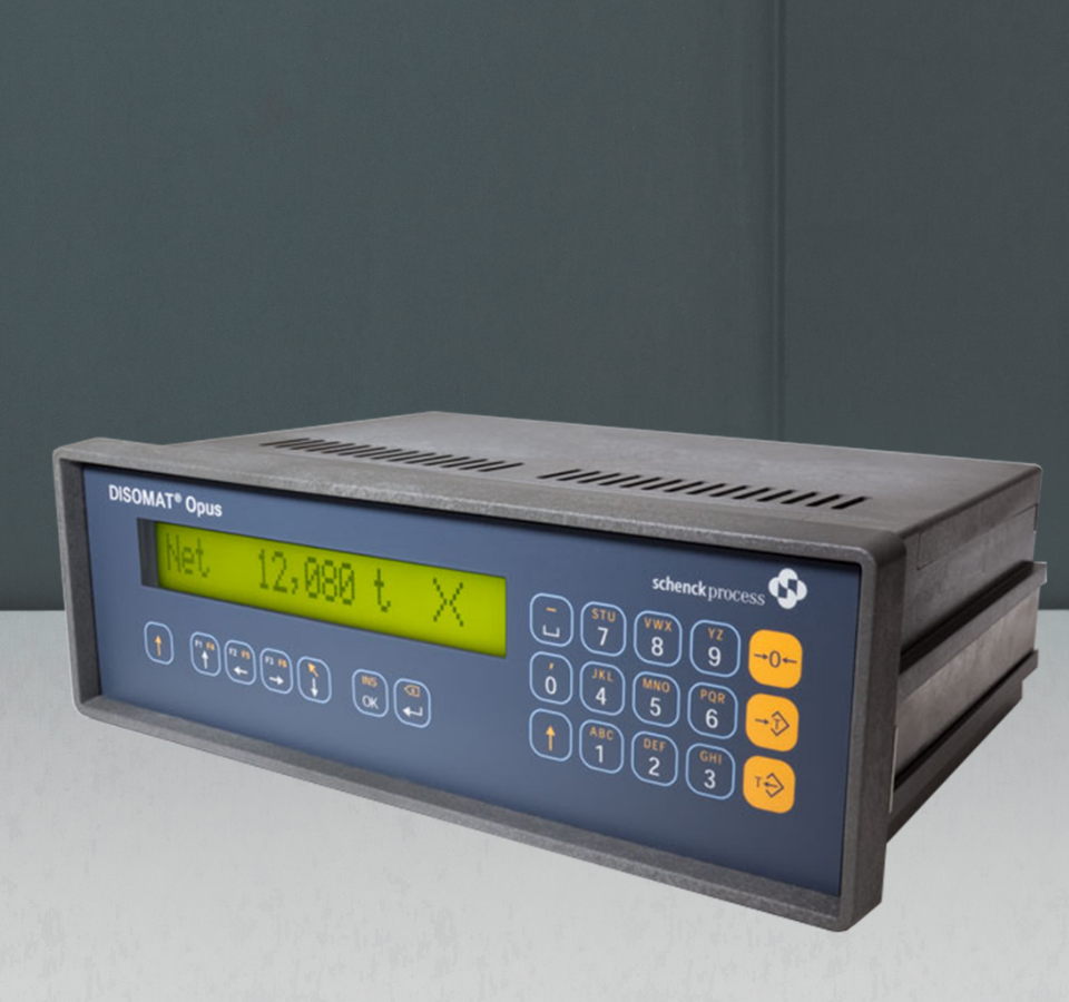
The previous interface was very technical and required a lot of expert knowledge in handling the device.
The biggest challenge in the development of industrial scales is that completely different weighing tasks are performed by completely different educated and trained users in completely different processes and environments.
For CONiQ, the overarching goal was to develop a user interface that is easy to use and no longer requires user training.

Field Observation
To understand user tasks and needs and identify workflows, we visited various locations where scales are used.
Observation focused on user-scale interaction, user-environment interaction, and additional information needed by users but not provided by the scale.
Each observation was supplemented by additional interviews with users.
Our approach
With the help of our Data Driven UX Design approach, we integrated the user perspective into the development in several iterations from the very beginning.
01
First Wireframes & Clickdummies
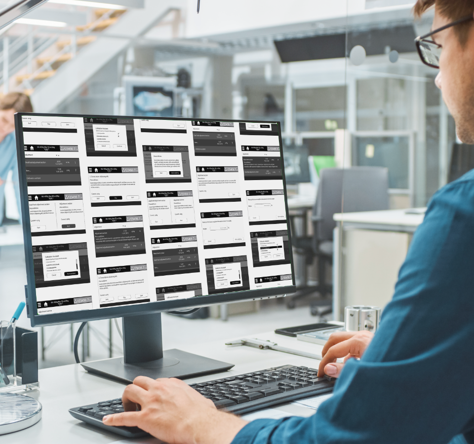
Wireframes were created to outline the first ideas developed.
This first iteration helped us to gather deep knowledge about the details of the project.
In order to quickly make changes and have a defined overall picture, the first interface concept was transferred into digital wireframes.

02
User tests
Core customers were identified and invited by us for interviews and short UX tests. This allowed us to test the main tasks of the interface as early as possible.
Afterwards, a lean test report was drafted for each test iteration and a conclusion was given with a recommendation for the redesign of the screenflow and screens.
03
First Visual Design
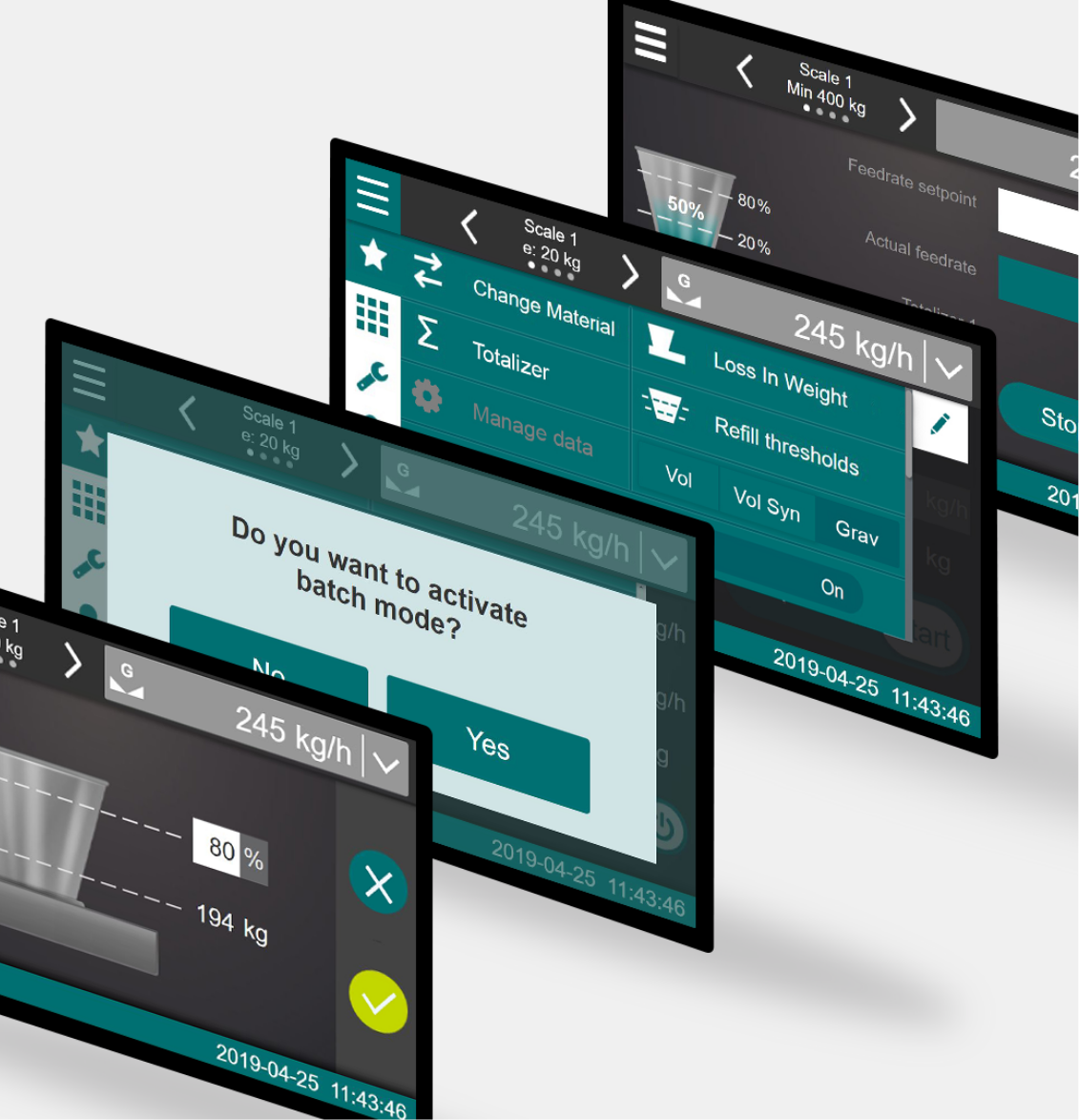
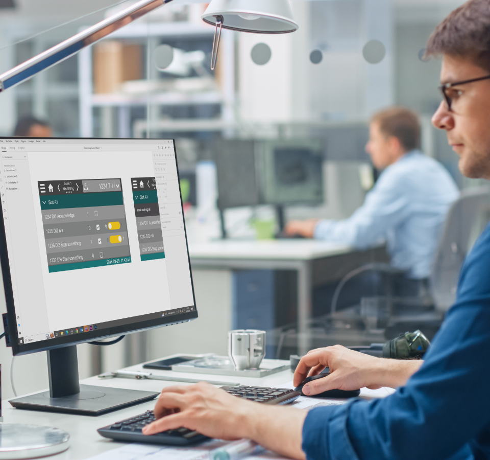
Based on the results of the studies, we started to design a first version of the screens.
The challenges:
- The display of warnings
- Variety of usage scenarios
- The small display does not allow Responsive Design
04
The result
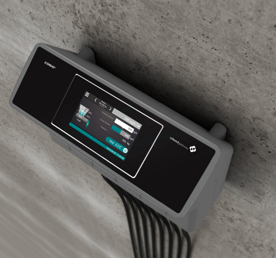
The result is a design that optimally covers the multiple areas of application of CONiQ for all users and enables special functions for highly specialized applications in a simple manner.
Since the scales are used in very different environments, the hardware was designed to be as flexible as possible.
Let’s get started!
Let’s talk about your challenges in a straightforward way and find out together how we can support you. Arrange your first free, no-obligation get-to-know-you meeting now.

