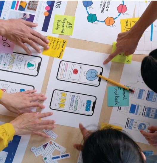
At Custom Interactions, we deal with our clients’ usability & user experience problems every day through our work as usability & user experience experts / testers. In doing so, we can observe that the same design mistakes are made again and again when designing user interfaces – especially on websites, because they have become more and more complex in recent years. They can now be displayed on many different devices: smartphones, phablets, tablets, laptops or the classic desktop computer. A 50-year-old employee who wants to buy something at the bakery on her way home from work calls up the store’s website from her work computer in search of opening hours. If the same employee were already on her way to her car, it is equally conceivable that she would use her smartphone to visit the same website. In a third example scenario, if the woman does not want to shop at the bakery on her way back, but on her way to work, it is also conceivable that she quickly uses the tablet in the living room to check the opening hours before leaving home. The three scenarios show: A website that is supposedly simple at first glance must be able to be displayed without problems on all device classes in this day and age. This blog post – and the second part next week – are therefore about 7 common usability problems (and their solutions) that have one thing in common – same website, but many different sized devices.
Problem 1: Element sizes (e.g. texts & control surfaces) change with screen size
Compared to the traditional computer screen, smartphone screens are small. However, when designing the website, it is not an option to simply shrink the individual elements (e.g. texts and control surfaces) on devices with small screens. In some circumstances, the text is then so small that it can no longer be read or can only be read with difficulty. Therefore, font sizes often even have to be enlarged for small screens. The same applies to user interfaces: While people sitting at a computer are equipped with a mouse or a touchpad, they operate a smartphone with their finger in most cases. This input device is less precise, and operating surfaces have to be correspondingly larger. As the smallest device, the smartphone therefore often places the highest demands on the size of content.
Solution: Select the size of control surfaces so that they can be easily operated with the finger. For an initial estimate of the size, you can use the key sizes of a common keyboard as a guide. Then the control surfaces will definitely be large enough.
For texts, you should select a font size that can still be read without problems on smartphones – at least so large that a maximum of six words can be written in one line in portrait format. As a further guide, you can also use the e-mail app on your smartphone; here, the texts are often displayed minimally small.
Problem 2: The text size is too big
If you implement the solution tips from the previous problem, you will notice that even shorter texts of five sentences can fill the entire smartphone screen. This leads to the second problem: The amount of text on web pages is often too large for smartphones. Even short texts seem long on smartphones and are reluctantly read (exception: websites that are all about the text, such as news sites / blogs). Many users then like to skip texts and start scrolling. If the amount of text is too high, this can unintentionally take a long time and tempt users to visit another website.
Solution: Keep it short. Put some thought into the text on your website and try to convey content per section in one to two sentences. It also helps if the concept of your website is self-explanatory and does not need to be enriched by text clues (e.g. “Click here to …”). If you do use longer text, try to create shorter sections by using paragraphs / subheadings. As a rule of thumb, the longest sections of text should fill no more than two smartphone screens in portrait mode. Images have also proven useful for breaking up longer texts. However, these can lead to another problem, which I will describe in the next section.
Problem 3: Images or image sections look different on small screens
When designing a website, the images to be used are often included in full resolution. However, this only makes sense if you want to select images for large screens. If these images are then displayed on a smartphone, two things happen: either the image becomes very small and is no longer properly recognizable, or the image section changes. The latter can lead to a complete change in the effect of the image and thus the effect of the website itself. An example can be taken from the image on the left:
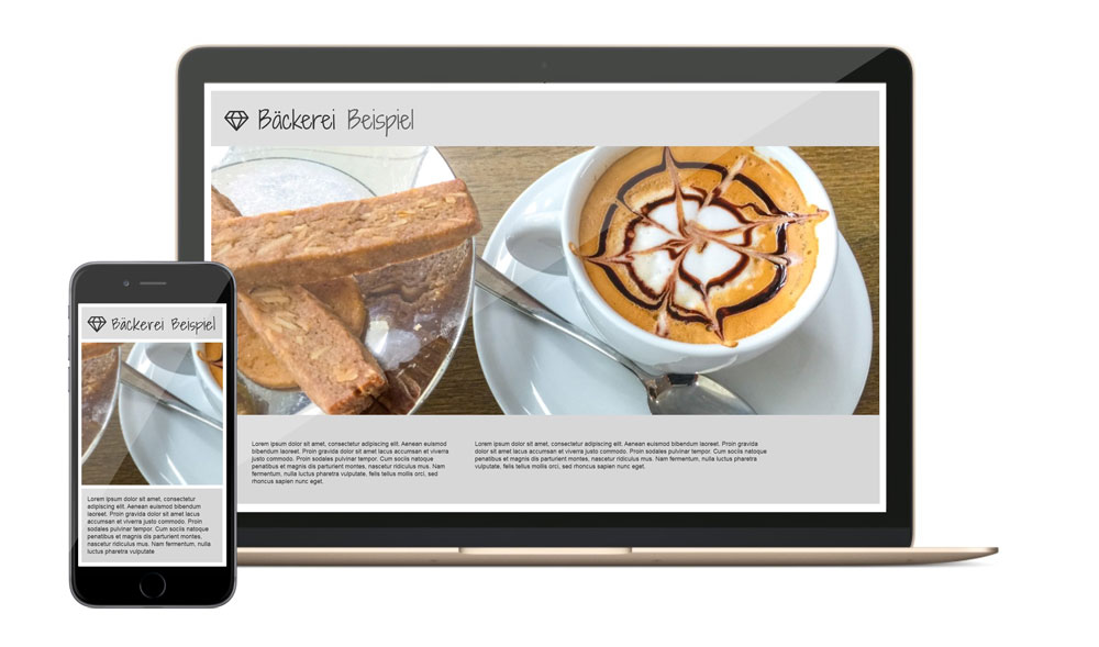
Negative example: Due to the reduction, the image detail becomes meaningless. Image source: (original image with baked goods & cappuccino): Rainer Sturm / pixelio.de
On the large monitor, you see the complete image embedded in the web page. On the smartphone, however, the image is not reduced as desired, but cut off. The image as such is no longer recognizable and becomes meaningless.
Solution: There are various solutions to this problem, which differ in the degree of effort required. The most elegant and costly solution is to provide different image sections or sizes for different screens. Alternatively, you can try to select images that still look good when reduced to smartphone size and where the important content is placed in the center – as you can see on the image.
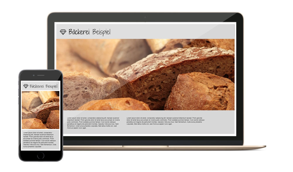
Positive example: The image is chosen in such a way that the image detail looks good even after being reduced on the smartphone and fits the theme. Image source (original image with baked goods): pixabay.com
The second part of the article will be published on 15.06.2016. I would be happy if you join us again then.
Image source cover image: pixabay.com