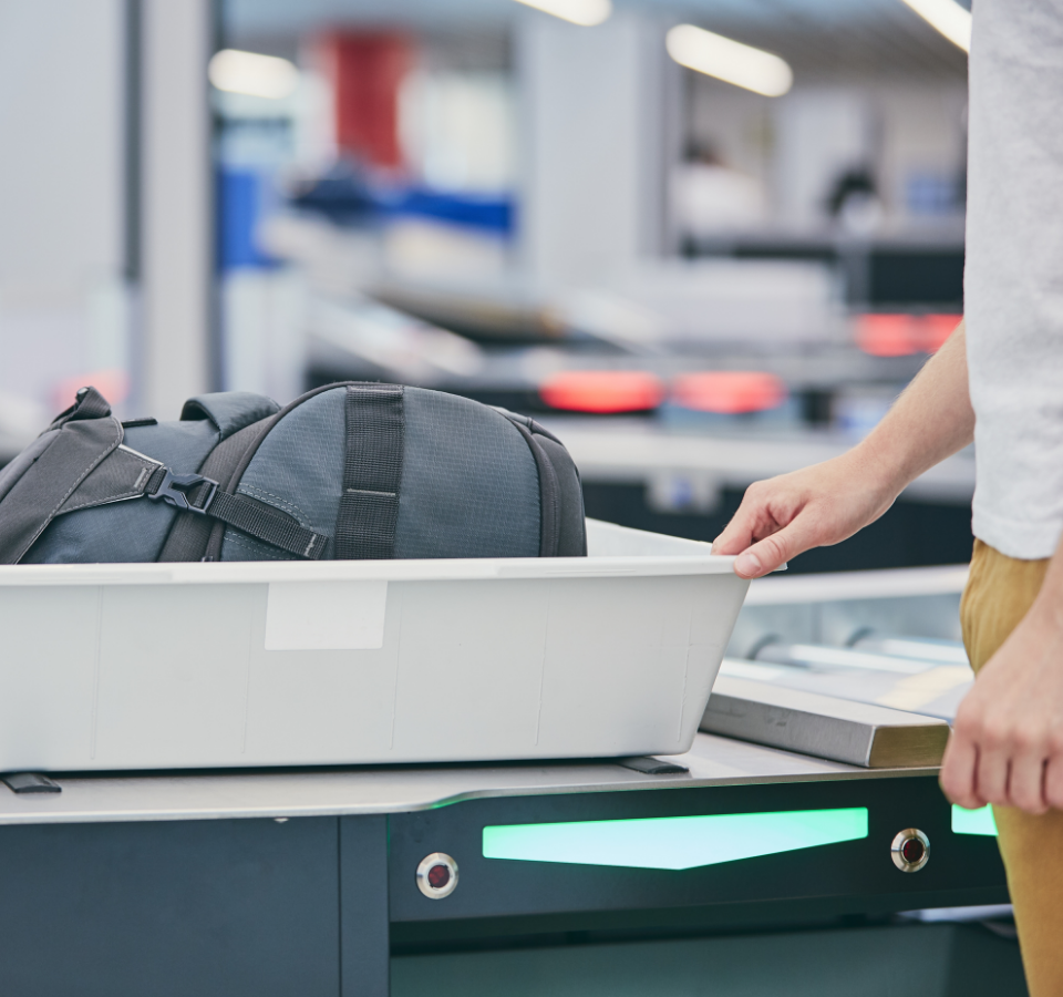
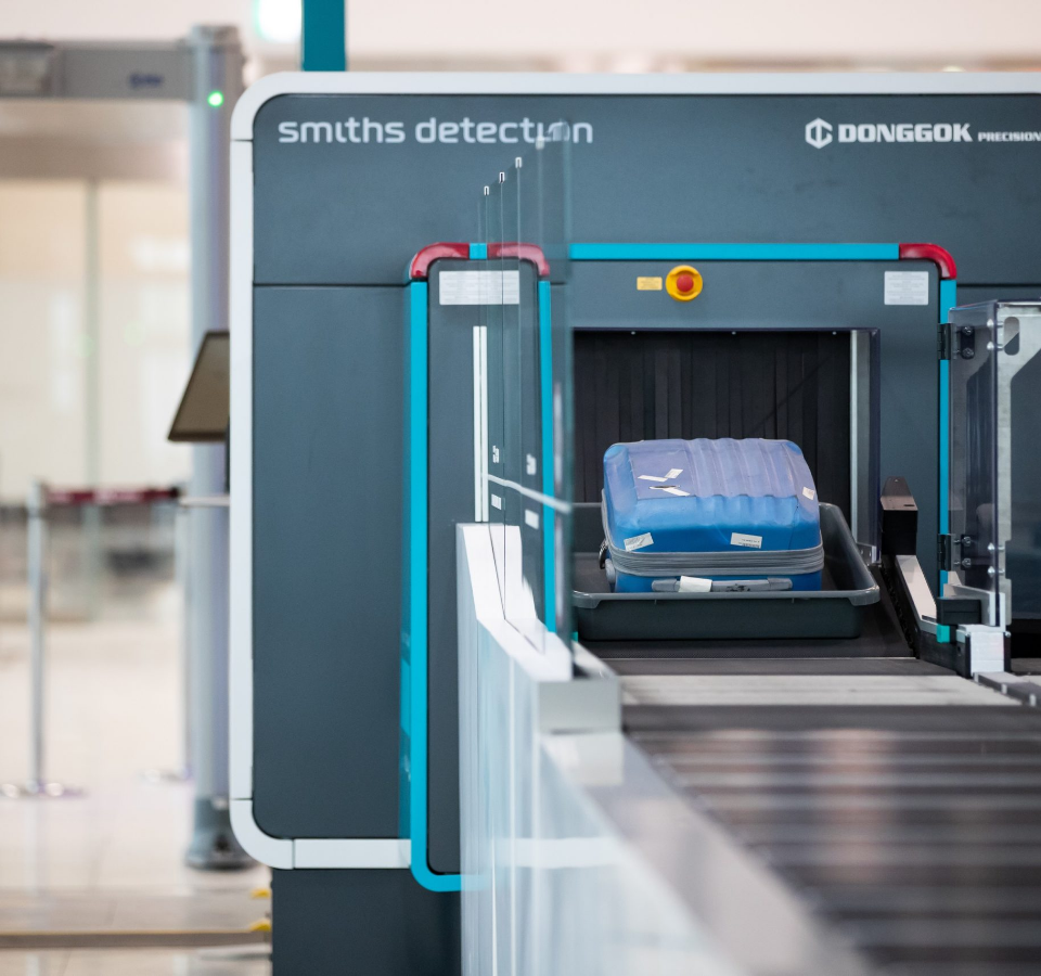
The demands on security standards and on the efficiency of processes at airport security checkpoints are constantly increasing. To be able to handle both at the same time, systems are needed that achieve the best results in the shortest possible time.
This is where the new HI-SCAN 6040 CTiX Dual GUI comes in. We have been involved in Smiths Detection’s project from an early stage. Find out how we helped with the development in this case study on our Red Dot Design Award Winner.


Initial situation & project
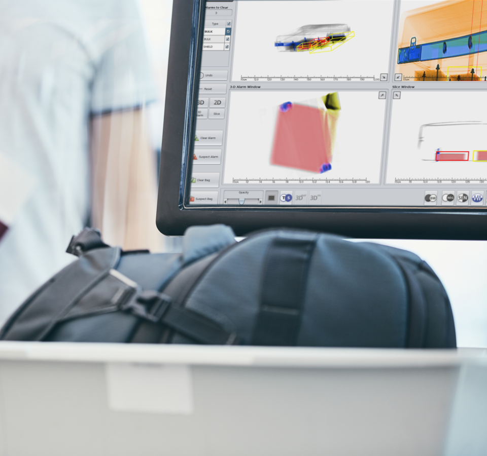
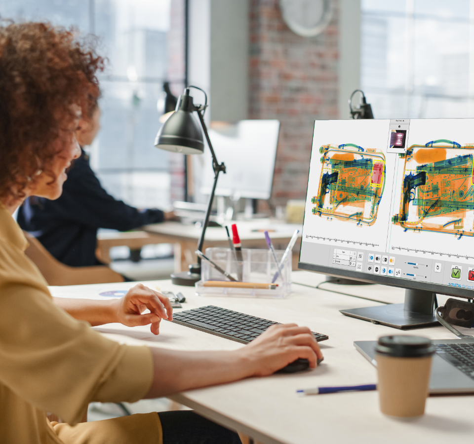
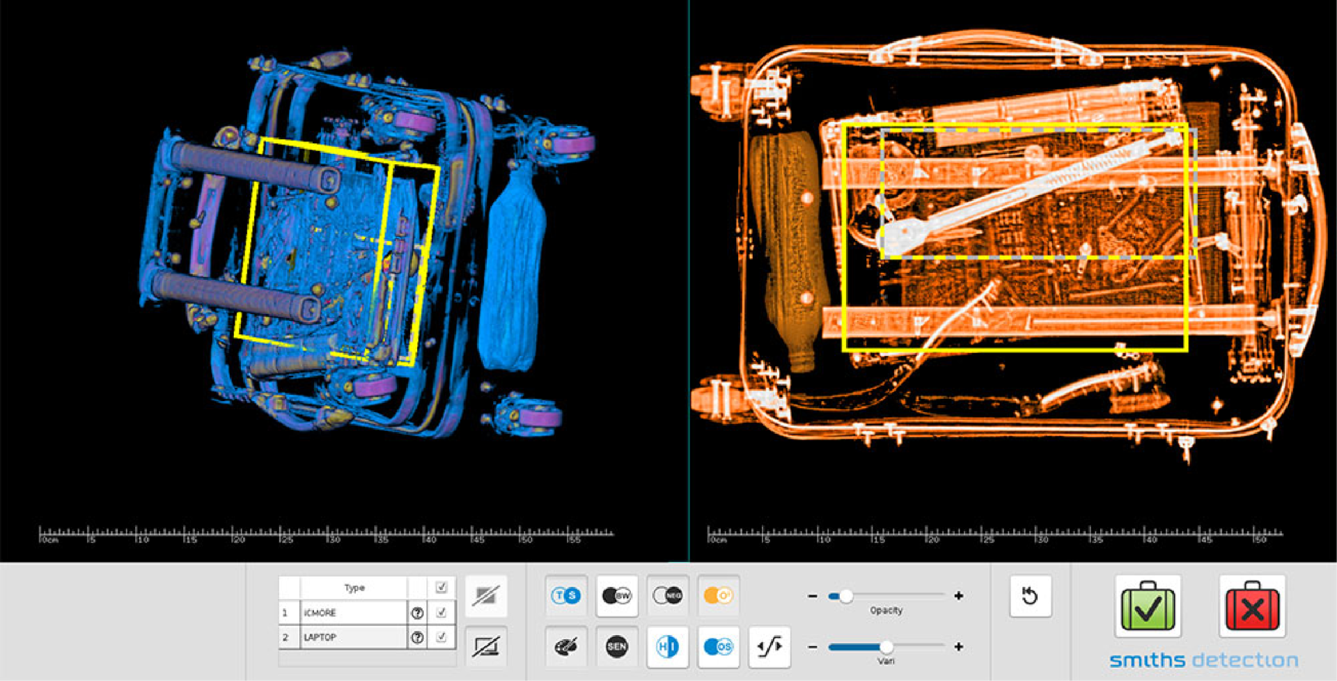
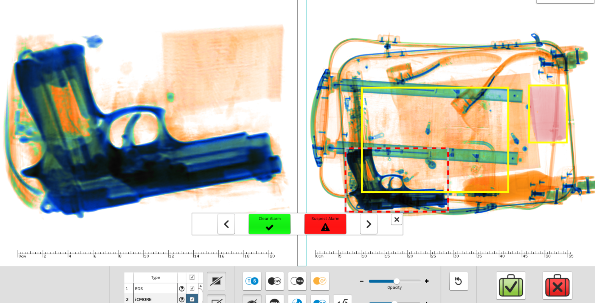
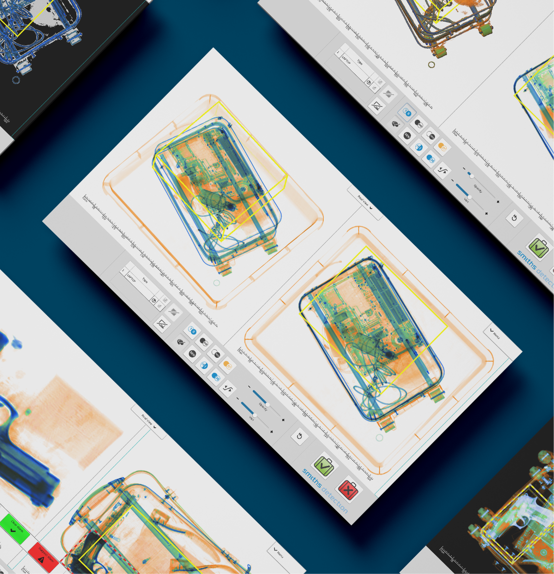
A new technology from Smiths Detection makes it possible to display 3D images of baggage at airport security checkpoints. This should make it easier for operators to visualize the scanned object.
But how is such a new solution to be operated quickly and safely in the stressful daily routine? That was precisely the goal of the joint collaboration: the redesign of the GUI.
Workshop & observations
The project started with a collaborative workshop to gather and process all of the Smiths Detection team’s knowledge of user workflows.
To complete the understanding of user workflows and requirements, we conducted on-site visits and took surveys.
Our approach
With the help of our Data Driven UX Design approach, we integrated the user perspective into the development in several iterations from the very beginning.
01
First Wireframes & clickdummies
In a joint kick-off we get to know your product and your goals. Here we work out what we want to achieve and the plan for implementing the goals, including a schedule. Guidelines, style guides and possible design restrictions are also discussed in this step.

02
Interviews & Tests
In further field observations, the new prototype was used to visit various international airports and show the interface to operators.
In order to get truly realistic feedback, users were not simply asked for their opinion, but were given tasks to solve with the help of the prototypes.
03
Evaluation
Each test was followed by a fact-based evaluation. If an idea was good, it showed up directly in data and errors. If an idea was bad, so was it.
Thus, step by step, we succeeded in finding the one way that led to an intuitive, easy-to-learn, and quick-to-use user interface.
04
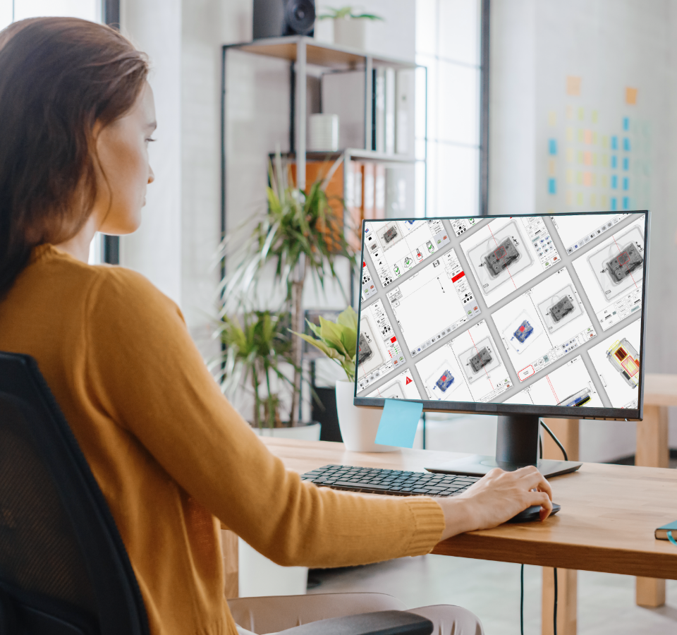
First visual design
With visual design in such a regimented framework, it was not easy to freely use all colors and shapes as desired.
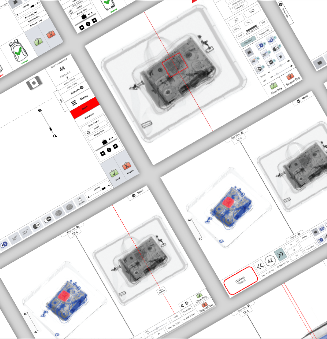
The multitude of functions was presented in such a way that operators have the possibility to access all functions if they wish, but otherwise see only the core elements that are really needed for the current task.
05
The result
The final design is visually very tidy. The controls are all placed at the bottom of the screen to avoid long click paths. Additional information is only displayed on request and can be made visible at the top of the screen.
The different display variants support the user in clearly recognizing hazards and marking them for the next station.
Compared to the previous technology, up to three times more people can now be checked.


Let’s get to know each other
Do you want to work together quickly, purposefully and respectfully? Let’s talk about your challenges in an uncomplicated way and find out together how we can support you. Arrange your first free, no-obligation get-to-know-you meeting now.