Well, it depends. Before the first joint project with Custom Interactions, my answer would have been less than 3. That’s how big the Lufthansa team was that was working internally with us on the revision and redesign of one of our pilot information systems in the cockpit. Now that the first joint project has been successfully completed, I would say at least 16.
So what has changed since then? For the first time, we didn’t just decide internally what we wanted to develop and then implemented that idea; we developed it together with users. That was a completely new approach for us, but we also had a good reason to question our usual approach.
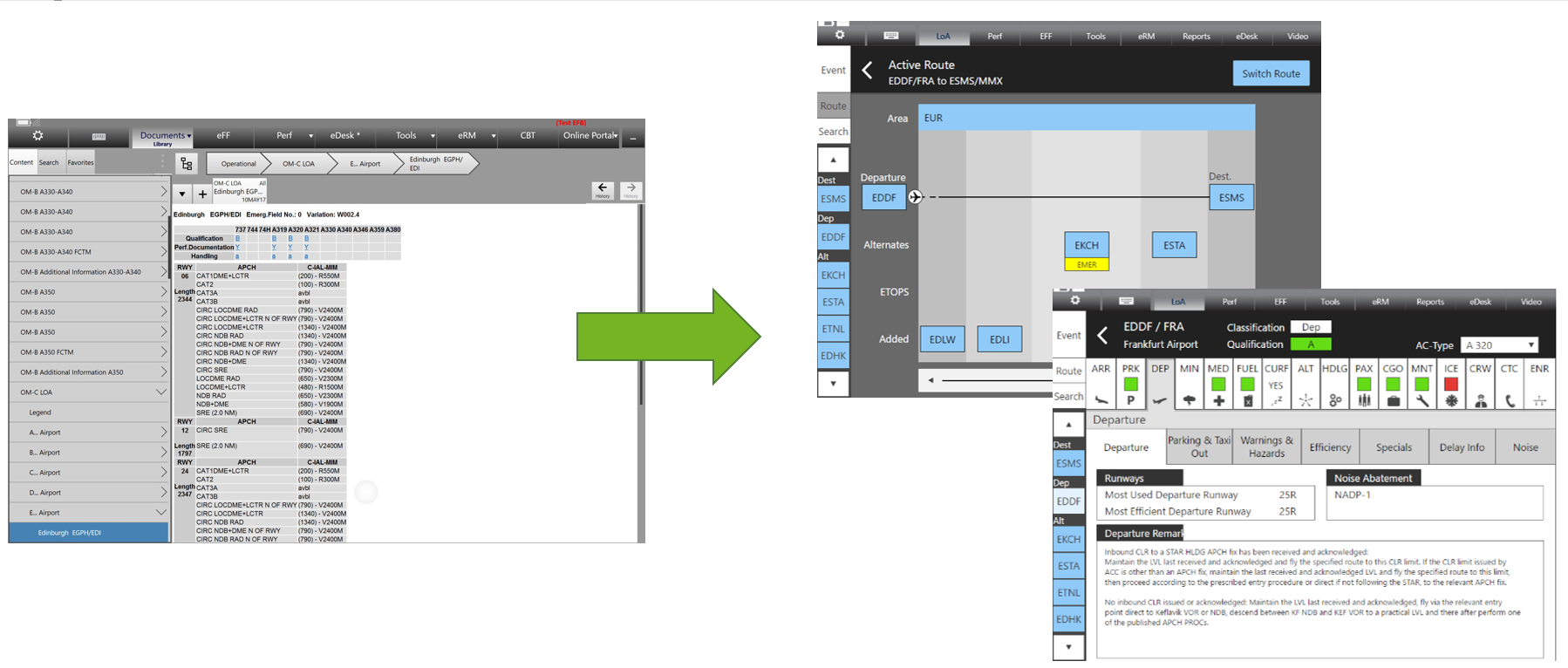
Our company has a system that contains information for all pilots on airports that Lufthansa is allowed to fly to. For us pilots, it is extremely important to be as well prepared as possible for every flight and landing. Among other things, we use this system for this purpose. Unfortunately, we have noticed time and again in the past that the current system is used less and differently than actually intended. From my own experience – I am a pilot myself, but as project manager I helped to redesign the system – I can say that this is largely due to the cumbersome operation and presentation of information. In order to nevertheless achieve the best possible preparation and execution of all flights, we decided to redesign this information system.
As with every project, we started with a tender, but this time we specified that the usability of the solution should play an important role. To make sure that everything was going in the right direction, our project team had already put a lot of effort into developing a sample solution beforehand, which we even enclosed with the tender. This sample solution already contained our ideas on how to make this system more usable for us pilots. So far so good, we thought. Many different companies applied for the tender. Among them was Codecare Software from Darmstadt, with whom we had already worked successfully in the past. However, unlike in the past, Codecare Software did not apply for the project alone, but together with Custom Interactions. The idea of the project proposal was accordingly unusual for us: On the one hand, Codecare Software naturally tried to respond to our wishes from the tender in the offer, on the other hand, this was always contrasted with the performance of Custom Interactions, who wanted to question the entire concept with the help of observations and surveys.
Even though the offer was unusual, the combination convinced us already in the award process. The consistent involvement of the pilot in the development was something that none of the other competitors offered. We were curious and tried it out. From the very first joint kick-off, it became clear that this project would run differently than previous projects. While there was an appointment to present the system and sample solution, most of the time questions were asked. And I don’t mean the kind of questions about what data is being passed to which system via which interface. Those are discussions we are used to and have over and over again in every project. No, this time the system as such was questioned. For whom it is made, for which purpose the user should use it, in which situation he should use the system, what the system should be able to do?
Questions about questions. The first workshop lasted about 3 hours. And the result of the workshop? Custom Interactions told us that they now have enough information to create a survey and observation guide and talk to “real” users. Hmm… unusual. Up to this point, we thought we had already shared everything important for the design. Still, we remained excited to see what would happen now, and I organized the first interview day. Here, Custom Interactions wanted to find out, based on the previous system, how pilots currently use it, in which situations they fall back on it, and so on and so forth.
The interview day came and 4 pilots were ready to be interviewed one after the other. All of them had the opportunity to show their approach on the real system and afterwards and during the interview they gave information about strengths and weaknesses, their usual usage and usage problems. They told what they would like to see in the new system and what they were currently missing. I would drop in from time to time, bring the colleagues to the interview and listen to how the interviews went. At the end of the day, the Custom Interactions interviewers wrapped up and left for evaluation. About a week later, we had our next workshop together.
I don’t remember exactly what I expected to get out of the workshop, but I do know one thing for sure: it certainly wasn’t that. The workshop started with a presentation of the survey results. What did our pilots say? What is currently good, what not so? What do they want? We listened to all of that, and tried to figure out if our sample solution was a good fit. So far as expected. And then came the second part of the workshop.
Custom Interactions had brought two proposals for the design of the system. The first proposal was completely different than anything we had envisioned. It would have changed the way of working with the information system by 180°. But on the positive side. Every pilot in the room immediately knew why THAT was exactly the solution we needed. Unfortunately, the proposal went so far beyond what we had previously envisioned that it could not be implemented on time and within the project budget (I have nevertheless already presented it to the next higher decision-makers on several occasions – after all, I would like to have this solution at some point). Instead, we decided on the second variant. Here, too, completely new aspects came in, which make the work with the system easier, more goal-oriented and faster for the pilots, and here, too, we were immediately convinced by the approaches. In the further course of the workshop, coordination took place between all project partners to ensure that the solution could also be implemented within the project framework in terms of time and technology.
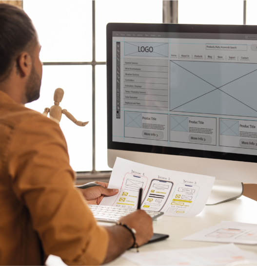
However, before even the first line of code was produced, Custom Interactions disappeared again and worked out the variant we decided on. Now by working it out, I don’t mean a glossy finish that has everyone shouting “Oh” and “Ah,” but Custom Interactions laid out the process. What does the user do and when? What information is displayed where? What happens when he then… ? And so on and so forth. The whole thing was implemented as a simple wireframe clickdummy, as the visuals were not the main focus here. In a further meeting we were presented with the current status and were able to discuss and contribute our ideas.
Then the first round of usability and user experience tests started. Using the click dummy, 3 pilots were allowed to navigate through the system and solve typical tasks. Questions were then asked and it was observed whether all tasks could be solved successfully. This was also followed by a joint workshop with the results and the resulting suggestions for adjustments to the system. A second round followed with exactly the same procedure, only with a significantly further developed click dummy, which was now also visually close to the later layout. And after about 6 weeks of development and survey time, it was ready, the clickdummy, which already followed the style guide of the Lufthansa applications and now “only” had to be programmed by Codecare Software. The layout was ready, the interaction was ready, the locations for the data displays were fixed and the division and naming of the content was fixed.

Before-and-after image: The old pilot information system and its revision, visually in line with the Lufthansa style guide for cockpit applications.

First Officer A340/A330-Fleet
Referent OPS / TECH / NAV Standards
Deutsche Lufthansa AG


