Last week we already talked about usability problems on websites. The first article described problems with the display of text and images and possible solutions. The second part now deals with website navigation, user behavior and long loading times:
Problem 4: Many subpages
Even small websites often have a large number of subpages. To display these and make them accessible, a menu is used. On computers with large screens, this approach is perfectly legitimate. However, on smaller screens, the menu usually does not fit completely on the screen. To solve this problem, it is often hidden under a “menu” button. It becomes difficult when the menu disappears during scrolling and the website is no longer logical for the user. Especially on smartphones, users then often have to scroll “up” to the menu again for a long time – this is unnecessary and annoying. In addition, orientation can be difficult if the website visitor no longer knows which subpage they are on.
Solution: As a first step, you should logically divide and name the subpages for the website users. Note: this division does not necessarily have to correspond to your own ideal categorization and naming in order to be coherent for the website visitors. In reality, it is very often completely different. If you have difficulties here, talk to selected users or ask a usability agency (and NOT a design agency). Again, be brief and think carefully about what information the user would like to have. This will probably allow you to eliminate or merge a sub-page or two, thus reducing complexity. However, if you have a lot of information on the website, you can’t avoid some subpages. In this case, make sure that the menus always remain quickly accessible. A first option would be a fixed menu at the top of the screen: when scrolling, the menu bar is fixed and thus always remains visible. A second option, especially for smartphones, is to quickly jump back up to the menu at any time, e.g. by using a button with an up arrow, which is located at the bottom right, regardless of the scroll position (see the following images).
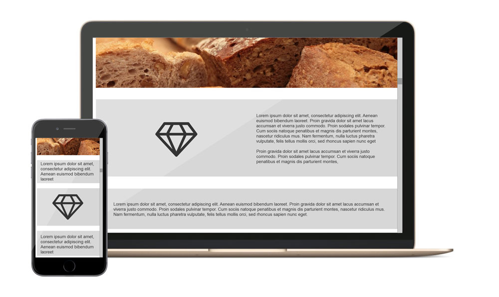
Negative example: When scrolling, the menu at the top disappears. To get back, you have to scroll all the way to the top again.
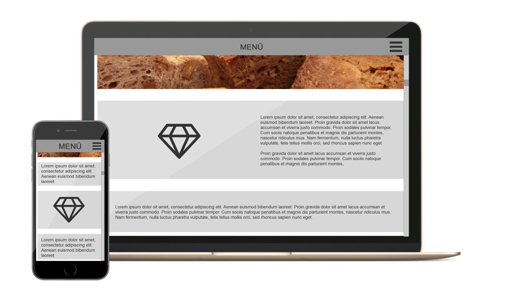
Positive example 1: The menu is fixed at the top of the screen and is therefore always accessible
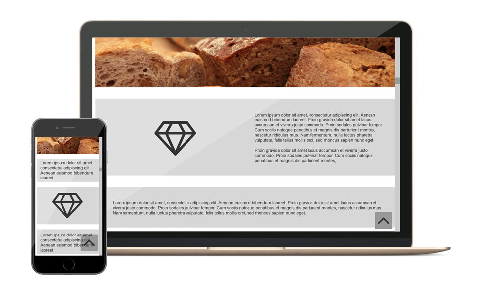
Positive example 2: Via the arrow button on the bottom right, you can quickly scroll up and thus reach the menu faster.
Problem 5: Known interaction patterns are used / assumed, although they do not work on all devices.
Many websites are initially designed for the computer. As described earlier, visitors to the website here have a mouse or touchpad at their disposal. This allows them to move the mouse pointer over the elements of the web page. Common practice is that buttons/ links are visually highlighted in this case, and that’s fine. But when using a tablet or a smartphone, this option does not exist. If you touch the surface with your finger here, a button is usually triggered directly. A preceding optical highlighting cannot take place, because the status “Mouse pointer over control element” does not exist.
Solution: Optical highlighting of control surfaces should not be necessary to identify control surfaces as such. Design control surfaces so that they look typical. For example, a border around the text (see images) and the use of familiar icons help.
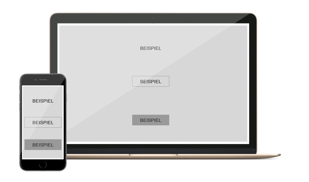
Negative & positive example: visual design of panels. Above: no special marking. The text “Example” is not recognizable as a user interface (negative example). Middle: outlining of the text for better recognizability. Bottom: Clearest possible separation of the user interface from the rest of the web page.
Problem 6: Mobile use of websites is not taken into account
The introductory example (in the first part of the article) of the employee quickly calling up the baker’s website on the go is intended to illustrate what is often not taken into account: Meanwhile, a great many websites are accessed on the go in search of a very specific piece of information (such as opening hours or addresses). What these situations have in common is that the website visitors usually have even less time than usual here, and they don’t want to spend it searching for the information they need on a website. In these situations, therefore, it is even more important that the website should lead the user to his or her destination as quickly as possible.
Solution: Again, think about the visitors to your website. What information might they want to retrieve? What devices are they likely to use to retrieve that information? For example, the bakery could present the opening hours as well as the address already on the home page. This way, the visitor in a hurry will be presented with all the information they need quickly and directly. The detailed description of the bakery’s own quality standards or its history is more likely to be read by visitors with more time. This information could be moved to a subpage, for example.
Problem 7: Long loading times
Elaborate websites with many / large images take longer to load than websites that rely less on images and more on text. Especially when retrieving information quickly on the go with a smartphone and a poor internet connection, long loading times can be annoying. However, as already mentioned, images are perfect for breaking up long passages of text and emphasizing them pictorially. Therefore, it is not an option to do without images – is it?
Solution: Once again, there are various solutions to this problem. If you have already stored images for different screen sizes (see problem 3), you are already at an advantage: Devices with smaller screen resolutions automatically load smaller sections of the images and thus less data. You can further optimize here by cropping the images for use on web pages and compressing them accordingly. Another option is to optimize individual subpages for faster loading times. To solve problem #6, you have already thought about the user. Now you can also use this information to optimize the loading times of your website. For example, the bakery in our example could use only a single image on the home page to make the website appealing while still allowing quick access to the opening hours as well as the address. On the other hand, on the subpage with the history of the bakery, more images can be used, as it was assumed here that the visitor has more time available.
Conclusion
In this blog post, I have shown you 7 common usability problems that occur when designing websites. I also showed you solutions to help avoid or fix the problems in the first place. Here I would like to note that for each of these problems there are other possible solutions and not every one works equally well for every website. Therefore, this blog post is not a substitute for expert advice.
Many of the problems pointed out come from the fact that when designing a new website, the version for the large computer monitor is considered first. Here I have a lot of freedom and can let off steam with design and layout. However, I advise you to take a different approach, which is also known as “mobile first”: first think about the smallest version of your website, the version for smartphones. This is where most of the limitations exist and therefore you can “scale up” this version much easier than the other way around “scale down” the desktop version.
If you already have a website designed primarily for large screens, in most cases it makes sense to fundamentally rethink the existing concept instead of adapting it. Often, the first approach is to design a “mobile” version of the website and leave out all the information from the original version that is not suitable for small screens and touch operation. This “slimmed down” version is then used in parallel with the previous version and has great potential to annoy the user: imagine again the employee who looked at the bakery’s website at home on her computer and remembered that the opening hours are noted here. Later in the day, the employee wants to take another close look to see if the bakery is still open and visits the site again, but this time using her smartphone. Because the baker did not fundamentally rethink his website, but only adapted it, he omitted the elaborately designed subpage with the opening hours in the first approach, because it was not suitable for smartphones. The employee can now no longer find the information, even though “it was there this morning after all.” This creates frustration.