In this article we will present you the most important Visual Design Trends 2023. And what do you need it for? If you want to convince your users, you not only need to depict their tasks as simply and understandably as possible, but also be strong in the visual area.
The knowledge imparted here will enable you to name a visual user interface design that users will perceive as modern and in tune with the times. Since trends are often short-lived, we have taken care to show you primarily those trends that, in our opinion and experience, are as future-proof as possible and will be in demand for a long time.
With our suggestions you can create the basis for a user interface that is modern and up-to-date for a long time. Have fun with our selection!
Trend 1: Motion Design
You guessed it: motion means movement and this is what motion design is all about. So it’s the design of animated elements through typography and graphic design.
Motion design can now be found on almost all websites and in all applications. The particular advantage is that it “animates” the screen by giving the user a sense of movement. This is much more exciting than a static screen that provides little feedback for the user. Since motion design appeals to the senses more than a lifeless screen, users are more involved and the overall experience becomes more immersive.
Where is motion design used?
- In lettering and logos that move to draw attention (known to designers as “kinetic topography”).
- In animations that introduce something. For example, when you’re new to a page and the image elements “fly in,” stack up, or build up in an animated way.
- In gifs and similar animations that are often used, for example, in learning applications like DuoLingo.
- Cinemagraphs: that is, partially animated images on which individual elements move (like rain or falling leaves, but also informative elements like a graph).
Quelle: Nexusstudios/ DuoLingo
Quelle: Wickret
Trend 2: Clean Design
Clean design focuses on overview, clarity and a restriction to the most important elements and information. Clean designs are often kept in a simple black-and-white style. They appear tidy and the user quickly recognizes which elements should be in the foreground.
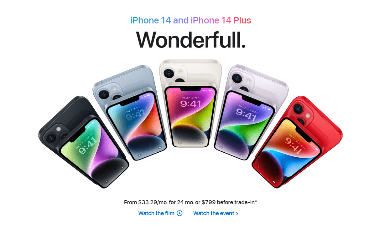
Source: Apple
The advantage: the information or functions you want to highlight are quickly in the user’s focus and they can easily find their way around your application or website. So it provides clear communication between product and user.
Clean design is not a new trend, yet the importance of this visual design continues to grow. In many areas, it is moving from best practice to standard. This is hardly surprising, since users are exposed to a huge flood of information every day. Clear communication through a clean design saves valuable energy and time for users.
In addition, this visual design radiates calm, order and clarity. It looks classy and stylish in a timeless way – so it’s no wonder that clean design is not only gaining in importance, but will also endure in the long term. The following example from Revolut shows you exactly that:
Source: Revolut
Trend 3: Multicolored elements with color gradients
Multicolored elements are more in demand than ever. Individual buttons, for example, are often designed in multiple colors with slight color gradients. These color gradients are also frequently found on cards and design elements. Tip: Aurora gradients are currently in particularly high demand. Many design programs allow you to create these aurora effects with just a few clicks. You can find the appropriate tutorials on platforms like YouTube.
An example of this can be found on Clyde’s page.
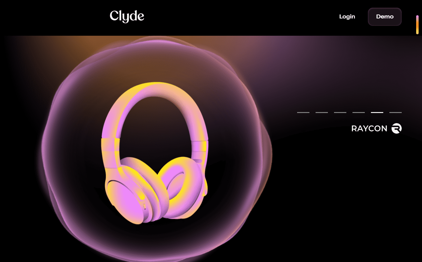
Source: Clyde
Often these elements are also slightly blurred in the background. This blurred effect then looks a bit softer and draws less attention away from the actual content.
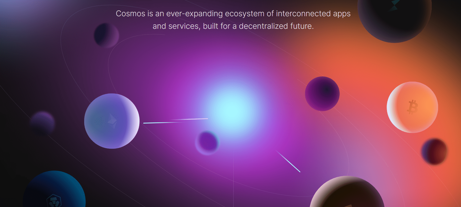
Source: Cosmos
Trend 4: High Contrast and Monochrome Visual Design
Many of the biggest brands and global players use high-contrast elements to draw attention specifically to a message or a particular piece of content. It doesn’t always have to be black and white combinations. What is allowed is what fits with the rest of the user interface design and stands out positively visually without “not fitting in”. A visual design with high contrast could look like this:
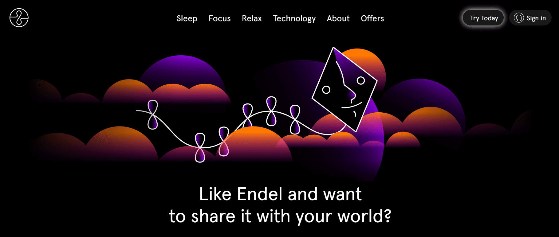
Source: Endel
A high contrast between two colors also ensures that elements and text fields are easy to see. This can make the entire user interface much more accessible. You can find a very good example right below this text section.
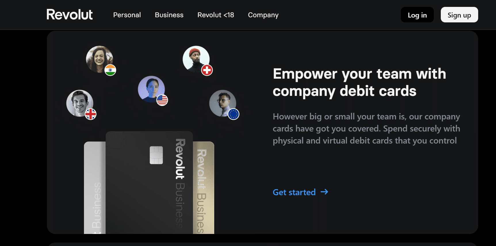
Source: Revolut
Caution. Too much contrast can quickly lead to eye strain (eye strain). You want to avoid that at all costs with your user interface.
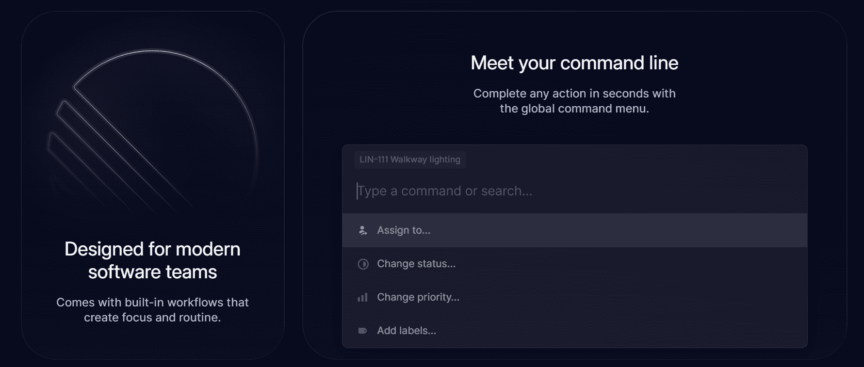
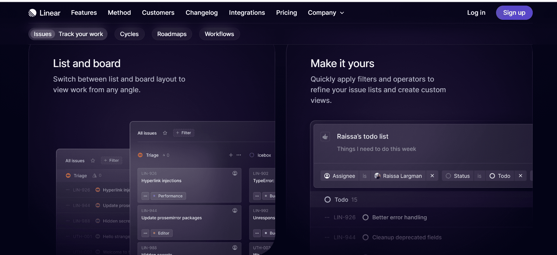
Trend 5: Dark Futuristic and Cosmic UI (often with glasmorphic elements).
Many user interfaces offer a dark night mode, which is popular with some users. A Dark Futuristic or Cosmic UI is much more than that, although the dark design of a night mode underlies them all.
Futuristic elements are often used here, for example, glass morph elements. Examples of this are glass background bricks. These are often transparent and have a sort of frosted glass effect due to the use of a background blur.
Source: Linear
Source: Linear
Also common: Elements that are multi-layered and seem to float in space, as well as a light and subtle border around the translucent glasmorphic objects.
Thus, these designs are clearly inspired by the science fiction aesthetics familiar from many movies, series and video games. Therefore, the design often features visual elements and images from these themes. Frequently used elements are images or graphics of outer space, spaceships or spacemen. A positive example of this can be found on the GitHub page.
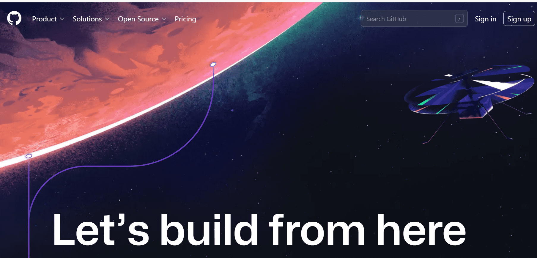
Source: GitHub
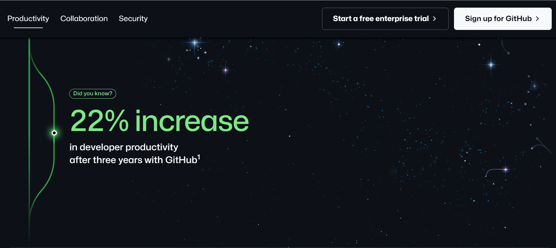
Source: GitHub
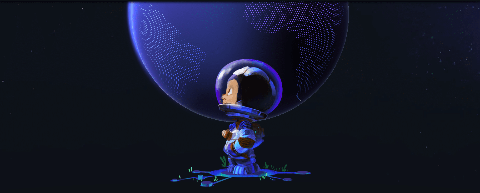
Source: GitHub
Advantages: Such a design exudes progress and innovation and positively stands out from other design trends. Thus, Dark Futuristic offers an interesting counterbalance to current trends such as monochrome design.
Trend 6: Imitations of real fabrics and elements
Another of our Visual Design Trends 2023 is the imitation of real fabrics and elements. Here, materials from our everyday life are taken as a basis for the creation of design elements. Very common are the images of metal, chrome, glass, water and wood surfaces.
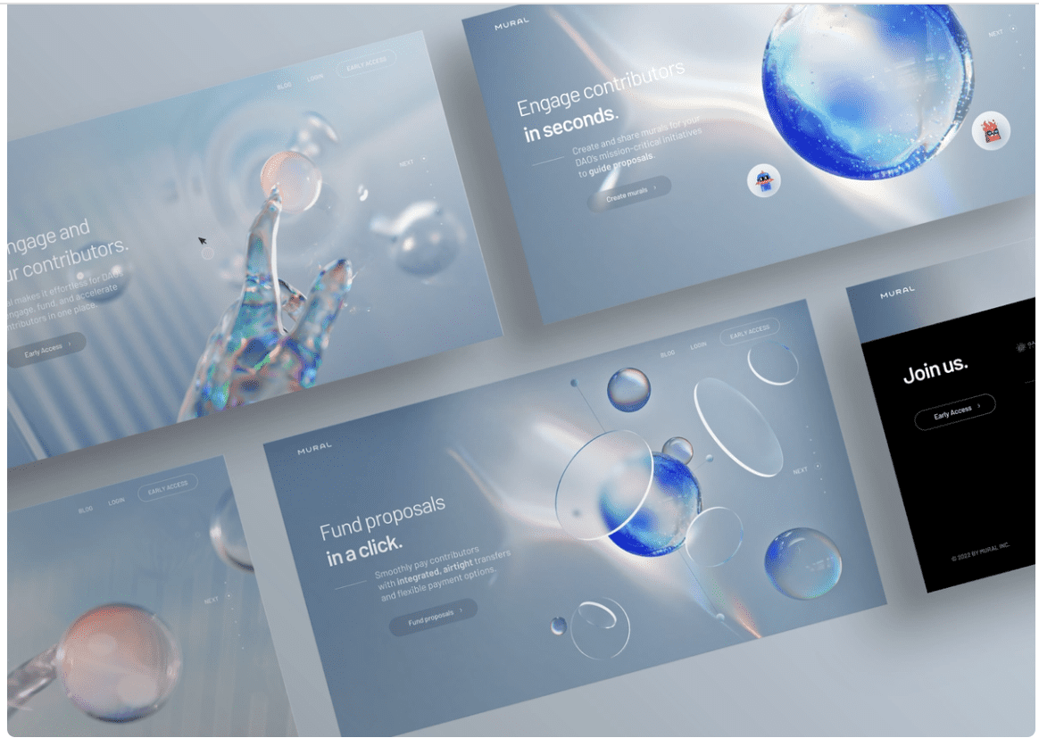
Source: Mural
This is a trend that has been around for a bit longer, but it is becoming more and more common and in demand. So, the imitation of real fabrics and elements has endured and is future-proof.
These imitations can often be seen in the background of large lettering. The lettering usually goes beyond the element. The following example plays somewhat with this expectation and even puts the element in the foreground. You can find this example on the Thoughtlab home page:
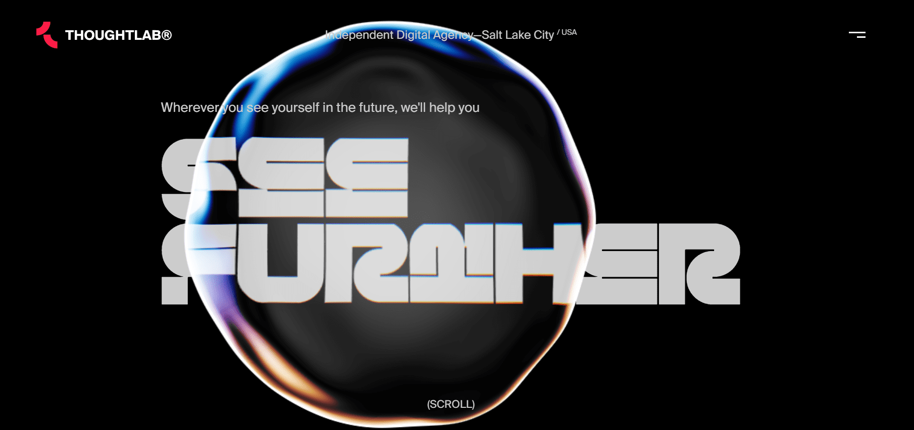
Source: Thoughtlab®
Care should be taken to ensure that the particular material being imitated matches the product. For example, an advanced and innovative tech product may lose some of its sense of modernity here if wooden elements are used. For an app that allows users to plan and share hiking routes, wooden elements in the user interface can be much more appropriate.
Trend 7: Gigantic typography
Think big! At least as far as typography is concerned, because large lettering draws the focus and is a very safe trend for the visual design of user interfaces. If you can make clear in just a few characters the core message of your product or the individual sub-page of the product, this is your chance to communicate it quickly and unambiguously.
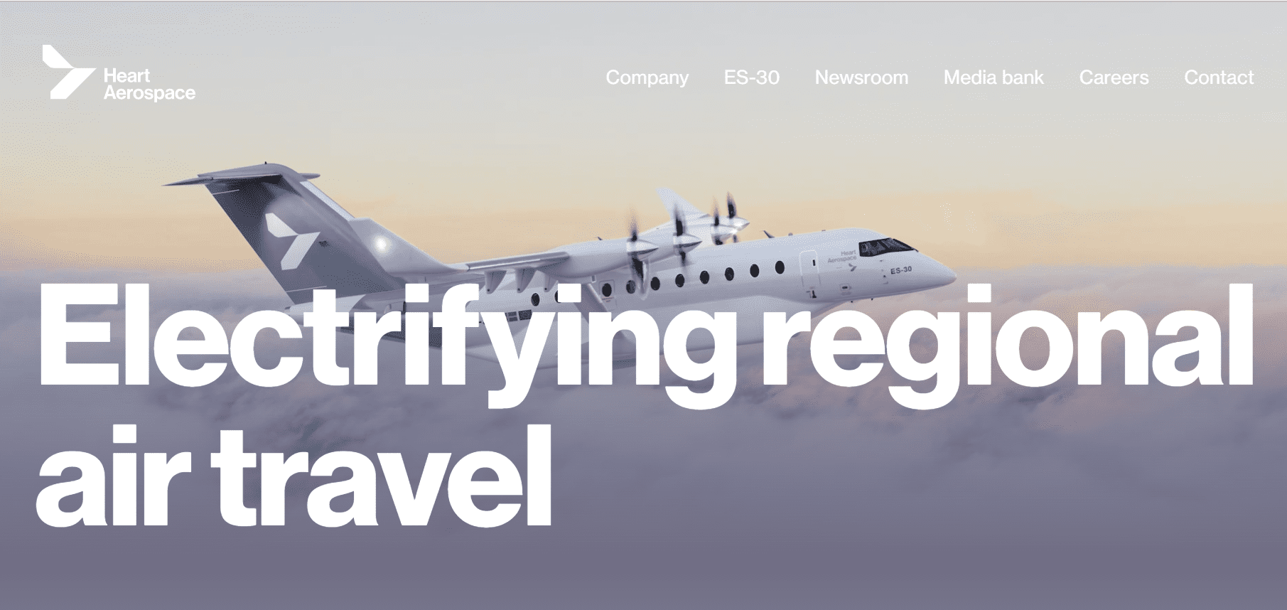
Source: Heart Aerospace
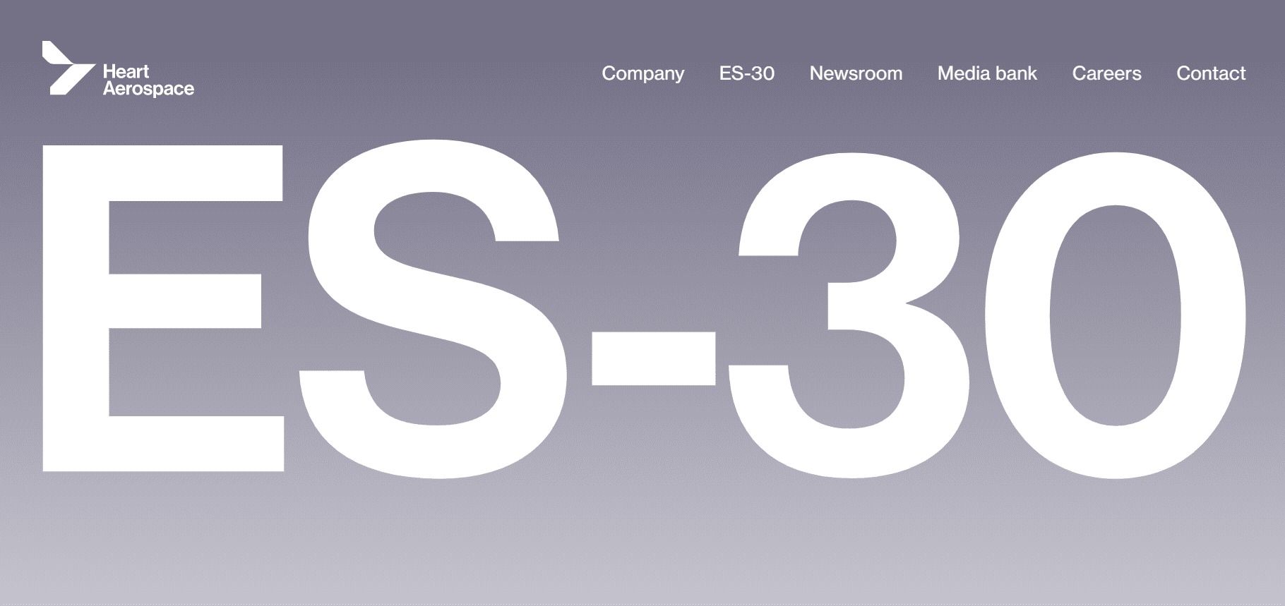
Source: Heart Aerospace
Which fonts are a safe bet? Sans-serif, for example, looks classy and neat. But font families such as Gilroy, Circular Std, Mont, Axiforma, Nexa or Galano are also good choices. You can often find them on free sources like Google Fonts or Font Share. You can see how such a font can look here:
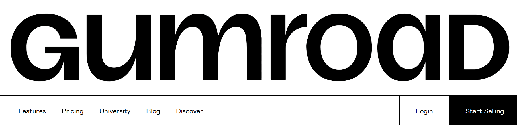
Source: Gumroad
The combination of trends
You’ve probably already noticed from some of the screenshots: many of our Visual Design Trends 2023 can be perfectly combined. Thoughtlab’s example combines gigantic typography with an element inspired by natural fabrics. Apple’s example shown here in the article combines a clean design with soft color gradients.
The list could be continued here and this shows us one thing: if two of the trends listed above go together, you should combine them. This way, you can quickly put together your own style. Of course, only if it fits your product and your industry.
Conclusion
In addition to clean and clear designs, focus-binding elements are especially in demand. These can be futuristic shapes, large typographies, but also soft and eye-catching color gradients.
The important thing is to find the visual design that fits your product and, above all, your industry. You can find out what that looks like in detail through user research and a market analysis. So, in order to create a Visual Design that is perfectly tailored for your product, your users and your industry, we recommend that you test design variations with real users.
Will you incorporate any of the above Visual Design Trends 2023 into a future user interface design? Or are you currently already using one of these trends? Write us a comment about this or get in touch with us directly via our contact form.
Are you unsure how your user interface design will be perceived by real users and what they expect from your product? We would be happy to discuss your specific case together in a non-binding and free introductory meeting.