What are wireframes and how can you do user research with them? What do you have to keep in mind? We want to clarify all this in this article. In addition, you will learn which questions you can answer with them and which advantages and disadvantages working with wireframes can have.
What are Wireframes?
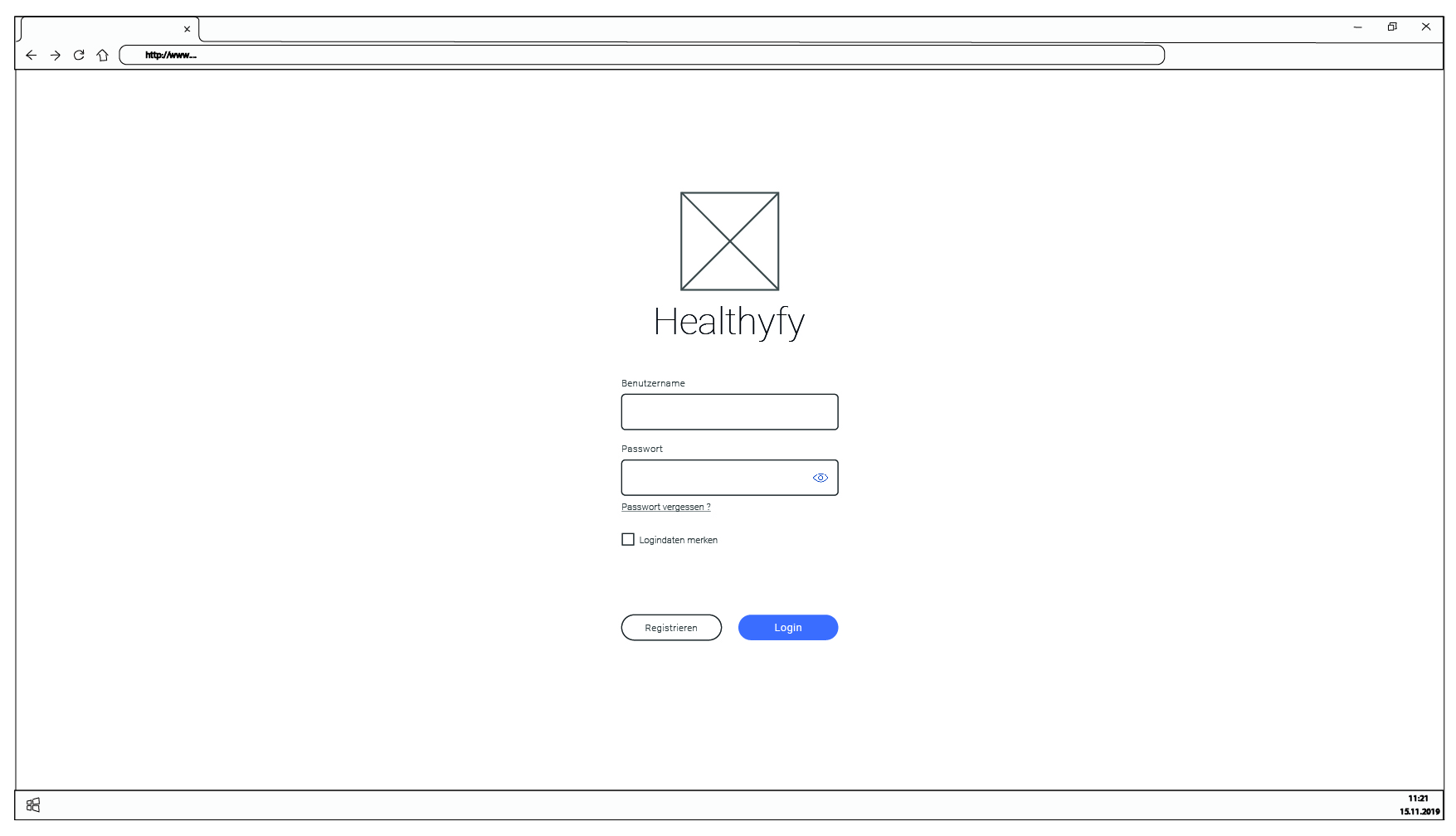
Wireframes are grid models that schematically represent a screen. They are used to sketch the structure, layout and possible interactions of a design. Different colors, fonts or images are not considered. In other words, they are a first simple prototype of a user interface.
Here you can see a wireframe for a login screen. The application “Healthyfy” is an example invented by us.

Wireframes help you understand how different parts of a user interface (navigation, main content, sidebar, etc.) are arranged. In doing so, they can facilitate communication about the content or its presentation. They allow for low-cost discussion between designers, developers, stakeholders, users, and customers regarding how a screen works.
Because of their simple visual presentation, wireframes can be easily modified and adapted. This makes them a useful tool for quick iterations and feedback loops.
How do you create wireframes?
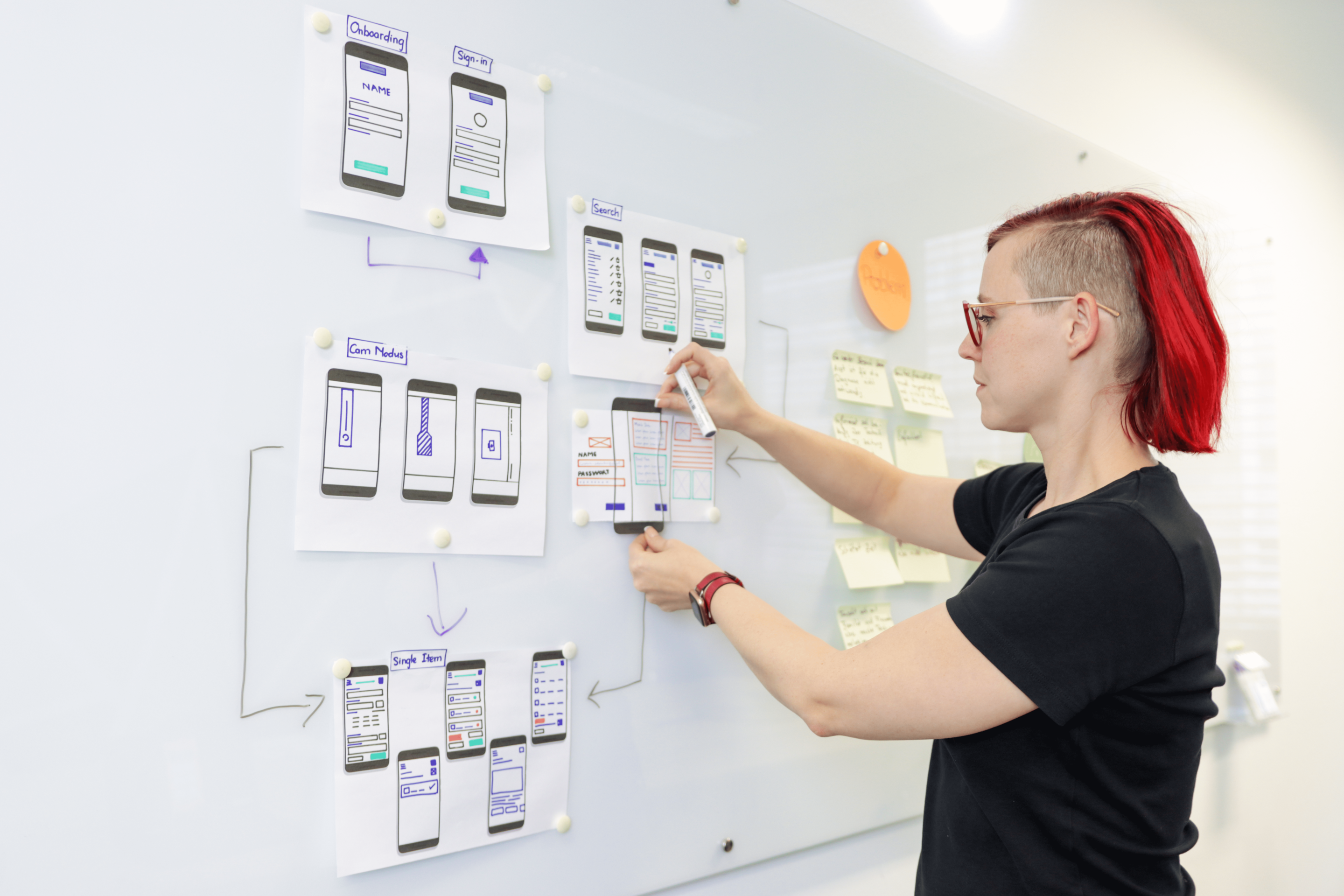
To create a wireframe, it’s best to start with pen and paper.
Start with a rough sketch of the layout. Where should the header, footer, navigation and main content be placed?
Add the main UI elements, such as buttons, text boxes, images and icons. At this stage, you don’t need to go into detail; it’s more about determining the placement and general relationship of the elements.
If necessary: Add placeholder text (e.g., “Lorem Ipsum”) for headings, paragraphs, and other text elements.
If needed, you can also add annotations to explain specific features or behaviors.
Then you can turn your content into a digitally created version that can also be operated, linking different screens into a flow.
There are many tools for creating wireframes. The most common are Figma, Adobe XD, Balsamiq, Axure or Sketch. Of course, wireframe models can also be created with pen and paper without digital help.
But how detailed should wireframes be elaborated? Are hand sketches enough or should it already be the digital click version? That depends on the goal for which you are creating the wireframes. One of the most important goals is the possibility to get feedback from later users. We’ll see how exactly this works in the next section.
How does user research work with the help of wireframes?
User research with wireframes is designed to investigate how users interact with a rudimentary model of a user interface. It can help identify and fix rough user experience and design problems early on, before investing too much time in fine-tuning and development.
A typical flow of UX testing with wireframes looks like this:
- You set goals: Before you start testing, you should set clear goals. What exactly do you want to find out? What questions should be answered?
- You create the wireframes: these can be hand-drawn or produced with special design tools to provide more detail and interactivity. See previous chapter.
- You recruit the participants: look for users who match your target audience. The number of participants depends on your test scope and goal, but as few as 5-7 users can identify many key issues.
- You may need to set up the test environment: You can do this in person in a room (e.g., usability lab) or online. Make sure the environment is as realistic as possible and that you can record participants’ actions and reactions.
- You conduct the user tests: Have participants perform tasks with the wireframes and observe their behavior. In a very simple case, you can think of it a bit like a flip book: the person “clicks” a button on a printed wireframe and you lay out the next page that would appear. Use open-ended questions in the process to find out what they are thinking and feeling. For example, “What would you do next?” or “What do you expect to happen when you click this button?”
- At the end, analyze the results: Analyze the results to identify patterns in the data. What problems did you encounter? Which areas were confusing or led to errors? You now know – based on real user data – what you can / should improve about the user interface. And in the simplest case, this only requires preliminary work with pen and paper – cool, right?
This process is iterative at best! Based on the results, you should revise the wireframes and make adjustments. Then you can run another test to see if the changes were successful. It is a continuous process of testing, learning and improving to ensure the best usability possible.

What are best practices when working with wireframes?
- User needs should be the focus: Always think about the users and their needs. Design the wireframes so that it provides an intuitive and user-friendly experience.
- Keep it simple and uncluttered: wireframes should not be cluttered. Focus on the essential elements and features.
- Feel free to use placeholders: since wireframes are not the final design, it’s okay to use placeholders for text, images, and other elements.
- Don’t confuse users: use consistent icons, shapes, and labels throughout wireframes to avoid confusion.
- Work iteratively: we mentioned it in the previous chapter, but we want to emphasize it again here: Create multiple versions, get feedback, and make adjustments. The first draft is rarely perfect.
- Stay flexible with the design: wireframes are a tool for planning and communication, not a final design. Be prepared to make changes as you discover new information or requirements in user testing.
What are the advantages of the method?
There are some advantages:
- Rapid prototyping: Because wireframes are often just lines, shapes, and text, they can be created and modified quickly, speeding up the design process.
- Cost efficiency: Errors or changes identified in the wireframe phase can be fixed much more cost-effectively than in later development phases.
- Facilitated communication: wireframes provide a visual tool that allows teams and stakeholders to have discussions about features, layout, and user flow before actual design and development begins.
- Early feedback: because wireframes are created early in the design process, you can gather early feedback from stakeholders, team members, or even test users to improve the design.
- Flexibility: Wireframes can be created in various levels of detail, from very simple sketchy representations to detailed, almost finished designs.
What are the disadvantages of the method?
Although wireframes offer many advantages, there are also potential disadvantages:
- Not always necessary: For smaller projects or clear tasks, wireframes may be unnecessary and could unnecessarily complicate the process.
- Tools require training time and skills: Creating interactive wireframes often requires specialized software and skills, which can add cost.
These questions are answered by working with wireframes:
- Where should I arrange elements (e.g. buttons, menu, menu sub-items) in my interface?
- What general usability problems does my product have?
- Where do problems (e.g. errors, waiting times, getting “lost”) occur when using my product?
- Does the design of my interface support users in their tasks?
Not the right method for your question?
In our method assistant we have compiled the most important methods for the most typical questions. Try out the method assistant and find exactly the right method for your question.
Choosing the right method is also made easier by the decision matrix in our book on usability and user experience design. There you will also find a lot of background knowledge about the method itself as well as UX & UI in general.
Conclusion
Wireframes are versatile and easy to produce. But above all, they are a good support for testing different arrangement possibilities of individual elements, especially in the early development stages of websites, applications and user interfaces. They are also useful for gathering early user feedback at the concept level.
Let’s find out together if wireframes are suitable for your problem and how a collaboration works in detail. You can find our contact details here.


