To design a good product, you need to know the needs and requirements of the users who will use it. UX testing provides you with exactly this essential data. But how do you “translate” this data into a User Interface Design that helps users accomplish their tasks and ideally creates a very positive user experience?
In this article, we provide you with a structured flow about the process that takes place,
When you put user data at the center of your product development. Here you’ll learn about our Data Driven UX Design flow, which illustrates why it’s so important for User Interface Design to keep testing your product with real users while it’s still in the development phase.
After reading, you’ll have a clear understanding of the connections between user data and design solutions, and know how to design a user interface that is tailored to the real user group, step by step.
In addition, we’ll tell you which mindset you can use to make the best use of UX testing results for your product.
May we introduce? The Data Driven UX Design Process!
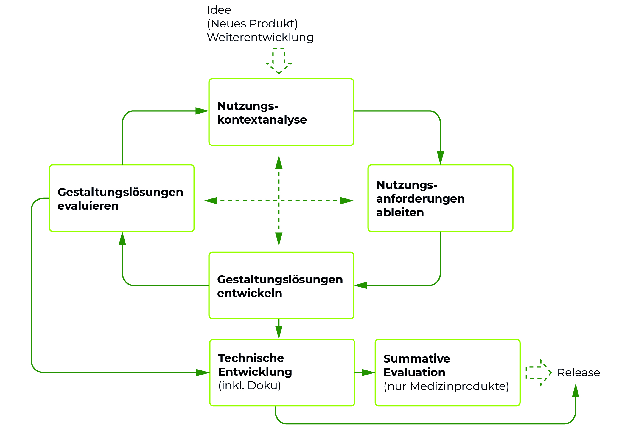
To illustrate the interplay between UX Testing and User Interface Design, we would like to introduce you to our Data Driven UX Design Process, or 3DUX® Process for short. The process describes the iterative process of UX testing with real users and the user requirements derived from them, on the basis of which the design then takes place, with which you iteratively continue testing.

If you want to learn more about how we can specifically help you with our 3DUX® approach, you can find an overview of our approach and services here. In this blog post you will learn the general approach regarding User Interface Design based on UX testing.
Question the idea: What exactly does your target group need?
The two basic questions you need to ask yourself before developing a product from the user’s point of view are the following:
What problem do you want to solve with your product?
For whom do you want to solve this problem?
Accordingly, you need a clear understanding of what tasks, goals and desires your future users have. This understanding then forms the basis on which you can build the concept of your product. In practice, we often experience that the product idea is “pursued” in a purely technical way. This often means that it is clear that the product also solves a technical problem. But is this a problem that the intended target group really has? Would the technical solution then also be a solution to the problem – and from the user’s point of view? Let’s assume you are sure you want to solve your target group’s problems with an app. But they find an app impractical and ill-suited to their needs. Without the feedback of real users at this early stage of your product idea, you would have stuck to a solution approach that would have found little acceptance on the market. As a result, a lot of potential is lost and the risk of a product flop increases drastically.
The solution: evaluate initial product ideas with storyboards
Present your solution, including the original problem, in a sketchy storyboard and present the result to a group of real users from your target group. Now you can find out whether the target group actually has the problem you’re addressing and whether the solution you’ve come up with is suitable for them. The advantage: You are still at a very early stage of your product and changes in the concept can be implemented very quickly and cheaply here – and yet you have already been able to gather real user feedback. Now you know whether your intended user group has the problem at all and whether your idea basically solves the problem of your user group. Where do we go from here?
The context of use analysis: on the track of the fundamental data
To design a successful product, you need to understand your users as best you can. This happens most effectively when you get to know the users in your (work) environment. With field observations and subsequent interviews, you now find out what a user does and why they do it, what problems arise, and what the workflows look like in detail.
You’ll also learn extensively about environmental factors in the context of use analysis and then be able to name how they affect users’ workflows. For example, a product that is to be used in noisy and stressful places must meet different requirements from the user’s point of view than a product that is to be used in a quiet workplace.
Derive user requirements
Once you have become acquainted with the user and the use environment, you can derive the user requirements from this. You now know what the user does, how he does it, and why he does it. Often, users use a user interface because they have to. That is, they need the user interface to solve or perform a particular task (and don’t use it because they want to use the product so much). Through your context of use analysis, you now know exactly what tasks the user needs your product for and what the workflow is for that task. This knowledge forms the basis for your user interface or product. The focus is on the following questions:
- What is the user’s goal?
- What workflows does the user perform with the help of the product?
- What does the user interface need to do to help the user achieve his or her goal?
- How can the user interface be designed to fit the work environment?
- If the user interface supports the user in his task and enables a goal-oriented completion of this task, then the user interface fulfills the minimum requirement for a successful product.
One task, many solutions
A task can be solved in many different ways. Let’s say your user has the task “Get from A to B”. The possible solutions include a variety of options: Driving, walking, biking, and so on. These different solution approaches result in different workflows. The “driving a car” solution involves completely different workflows than the “riding a bike” solution. So what does this mean for your user interface? In order to design a successful product, you need to test the solution approaches for acceptance by real users. In other words: Which of the solutions appears to the target group to be the most effective, practical and pleasant?
With wireframes step by step to the design solution
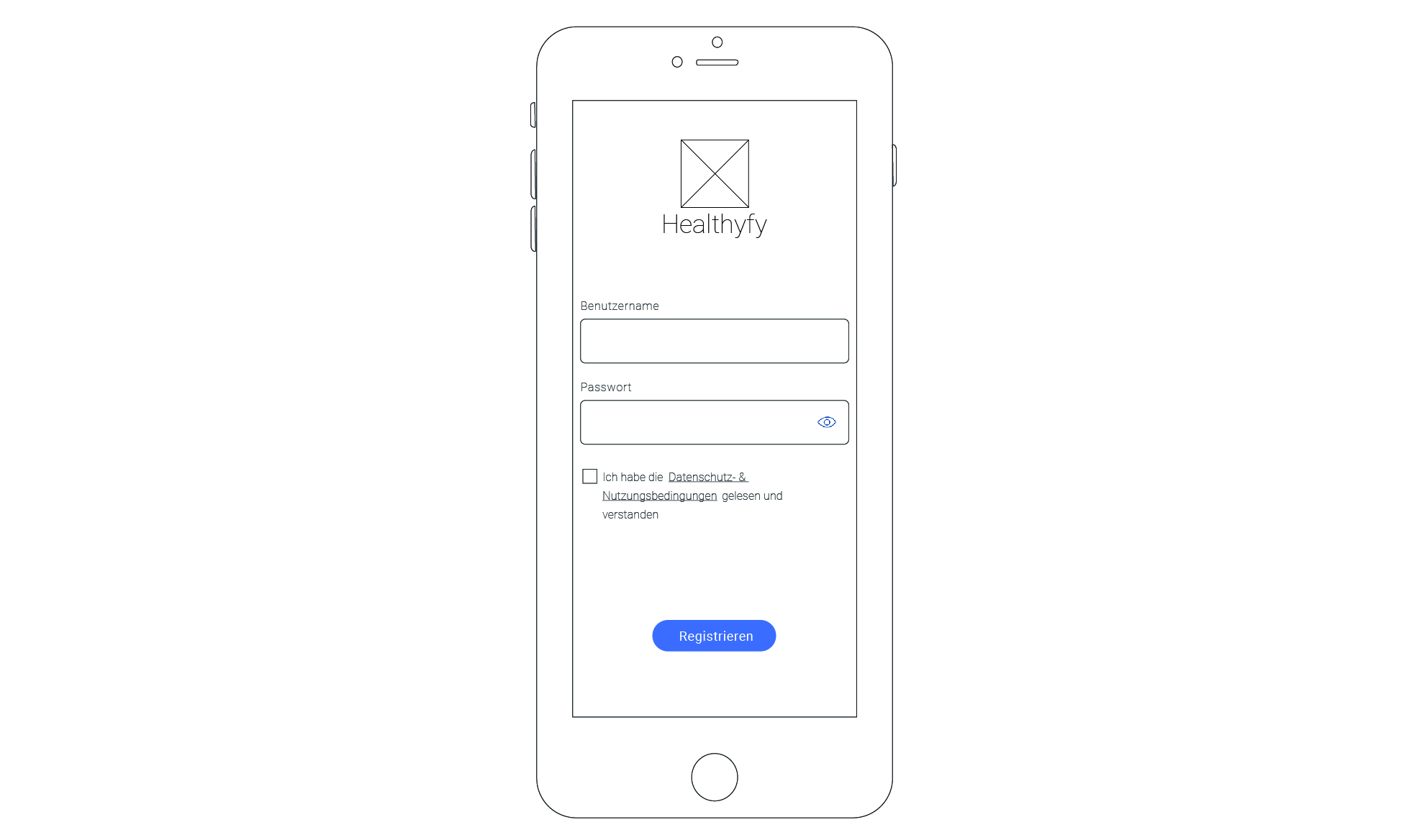
The best way to achieve this at an early stage of development is to use wireframes. A wireframe is a cost-effective prototype of an interface. Here, a wireframe model maps your solution approach at the concept level. Elements of the user interface are arranged here in such a way that they give the user an impression of how the user interface is structured and how it will function.

Wireframes can be presented to real users, who then test the depicted solution approaches for their suitability. User feedback allows you to evaluate the effectiveness and acceptance of your solution and to find out whether you have also mapped all workflows relevant to the user without errors. If a solution proves to be unworkable, you can very cost-effectively and quickly develop a better solution at this stage of product development and then present it to real users again. And that’s exactly what you do now, until you get feedback from real users that the workflows and features mapped in the user interface fit the tasks: Design wireframes, get user feedback, learn, repeat.
Attention: It is not (yet) about the visual design!
Your wireframes should only depict the concept level of your problem solution. If you already use visually designed elements, you will almost exclusively get feedback on the visual appearance of your design.
You want to use your wireframes to find out which solution is the best possible and how the arrangement of the elements of your user interface can be solved most effectively.
UX testing: How to iteratively improve your wireframes through user feedback
You then incorporate the user feedback on your solution approaches into new wireframes in order to test them iteratively with new users. This way, you quickly get feedback on whether your user interface is really good at the concept level and fits user needs. You always prioritize the mapped steps according to criticality and frequency. If the most critical and most frequently executed steps can be performed by your product without errors, you have already created a very good basis and fulfilled the most important user needs.
Integrate visual design
So far, we’ve left visual design out of the equation. But how do you take care of the visuals? You start by visually designing the most important wireframes. Initially, you should limit yourself to a few. Again, it is advisable to sort them by criticality and frequency. For the visual design, refer to style guides and other templates for the visual design of your product. If there are no style guides or other specifications that have been decided internally, the UX agency you have commissioned can develop these for you. Libraries of individual elements of an interface are also conceivable. You can then use these to create additional pages in your style.
The visual design can also be tested
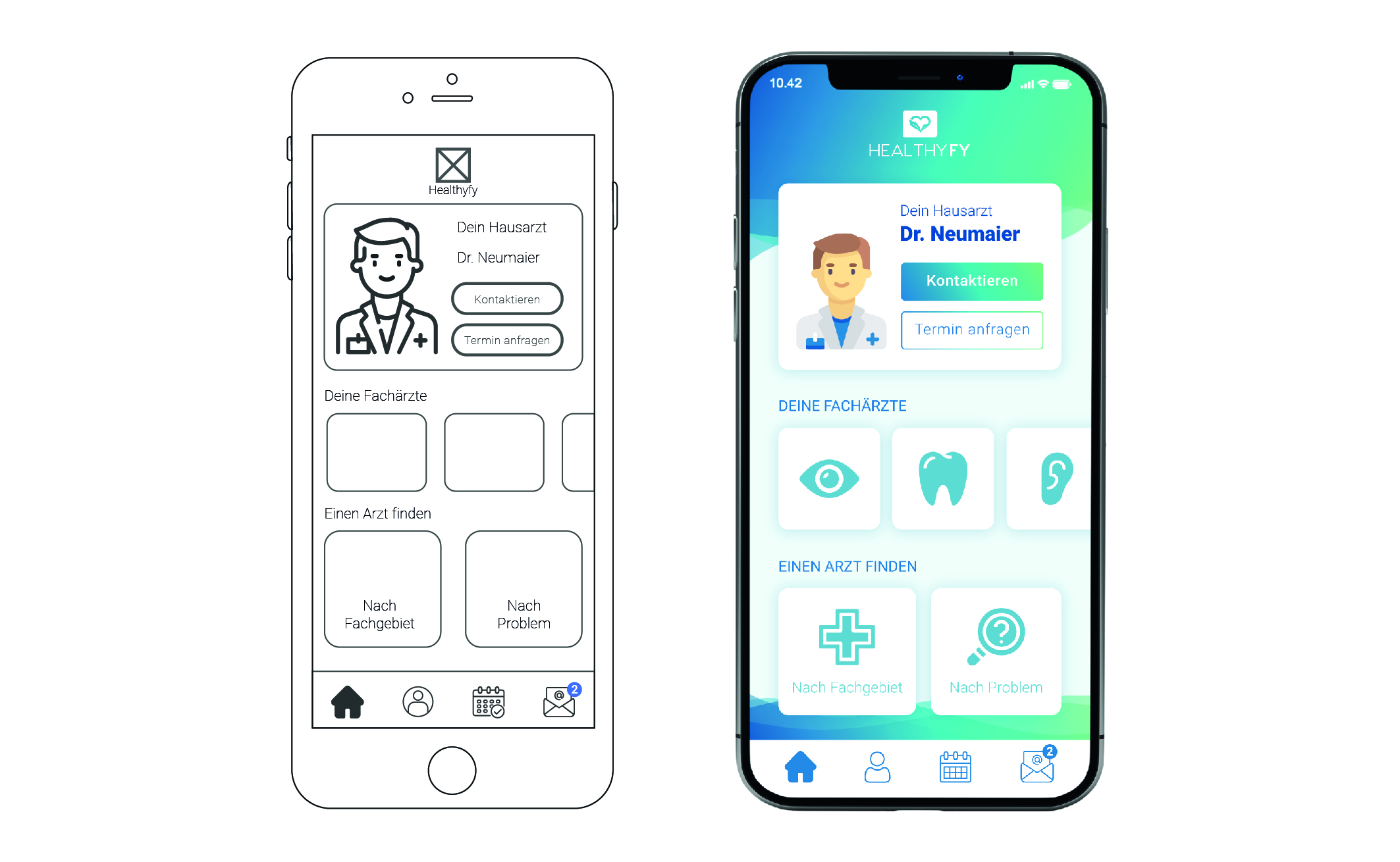
Testing a visual design with real users can also be useful during product development. The desire is for your product to specifically evoke associations that correspond to the desired product orientation. For example, it should appear modern or sporty. This effect on the target group can be determined with association space tests. The color scheme or a certain style in the design of the elements of a user interface can also signify membership of a particular product category. Brand values can also be transported by a visual design. User feedback can be decisive for the success of the visual design of the user interface. Here you can see the comparison between a wireframe and a wireframe including visual design.

At this point, we have gone through the Data Driven Design process (iterative) shown in the graphic above. This is followed by two other points that are important for you: awareness that all User Interfaces generate their own requirements and your own mindset with which you should approach UX Testing or User Interface Design.
Every user interface comes with its own challenges
Even though there are general principles for designing a user interface, they are not always equally applicable to all products. Each product comes with its own requirements and challenges. There are no general complete checklists that you can check off. Only user feedback from UX testing will give you valid data about how well your product solves a user problem. However, if you develop your product in a user-centric way right from the start, you can find out the requirements for the user interface based on data and implement them unerringly.
Be open to user feedback: your mindset.
Even though it can be difficult at times: What UX testing provides as user feedback is the foundation for your product development. Accordingly, you may have been under the assumption that you were developing something really great, but users are giving you scathing feedback. Your Mindset: User feedback is ideal for learning and developing a product that users are proven to want. The user is the expert on the task at hand! You are the expert on designing the product. The user can’t tell you how to do the interface, but they can give you important feedback about whether it’s good or bad.
Conclusion
To correctly identify user needs and then properly implement them in User Interface Design, you need to iteratively test your solution approaches with wireframes. Only by getting feedback from real users can you be sure that your product is on the right track. You should always test the User Interface Design on the concept level and only then start working on the visual design.
Only when a user interface allows the user to reach his goal effectively and efficiently, you have created the basis for a good product.
Would you like to learn about the advantages and disadvantages of the 3DUX process? Then we recommend our article “What are the pros and cons of Data Driven UX Design“.
What challenges does your product face? Let us know in the comments or feel free to get in touch with us directly via our contact form. We’d love to hear from you.
If you want to learn more about our approach and the 3DUX® process, you can find an overview of our product here.


